TAJO
Making youngsters understand what the future can hold for them.

TAJO is a Talentatelier voor Jongeren in Ghent. We gave the initiative a simple, approachable visual and verbal identity, with a logo whose O is a heart, a face and a pointer towards the future.

The story behind the work
What was the challenge?
TAJO, the Talentatelier voor Jongeren (Talent Atelier for Youngsters), is a new initiative in Ghent. Its purpose is to guarantee a successful educational pathway for youngsters between 10 and 14, with special attention for the kids who need it most. TAJO organizes experiential learning: a three-year cycle of 30 Saturdays per year. Experienced professionals from some fifteen disciplines, such as care, journalism, entrepreneurship and culture, give the youngsters a real-life view of what their trade offers. The youngsters get the information they need to make the right choices. They feel the professionals' passion and find the motivation to follow through. Some of Belgium's most appreciated entrepreneurs support TAJO, and it builds on examples in The Netherlands and Brussels. The basis for communication was fairly solid. An inspiring visual and verbal brand identity was still missing. It had to enthuse sponsors, since the initiative receives no government subsidies, as well as the local authorities and the youngsters who most need the support.
What choices did we make?
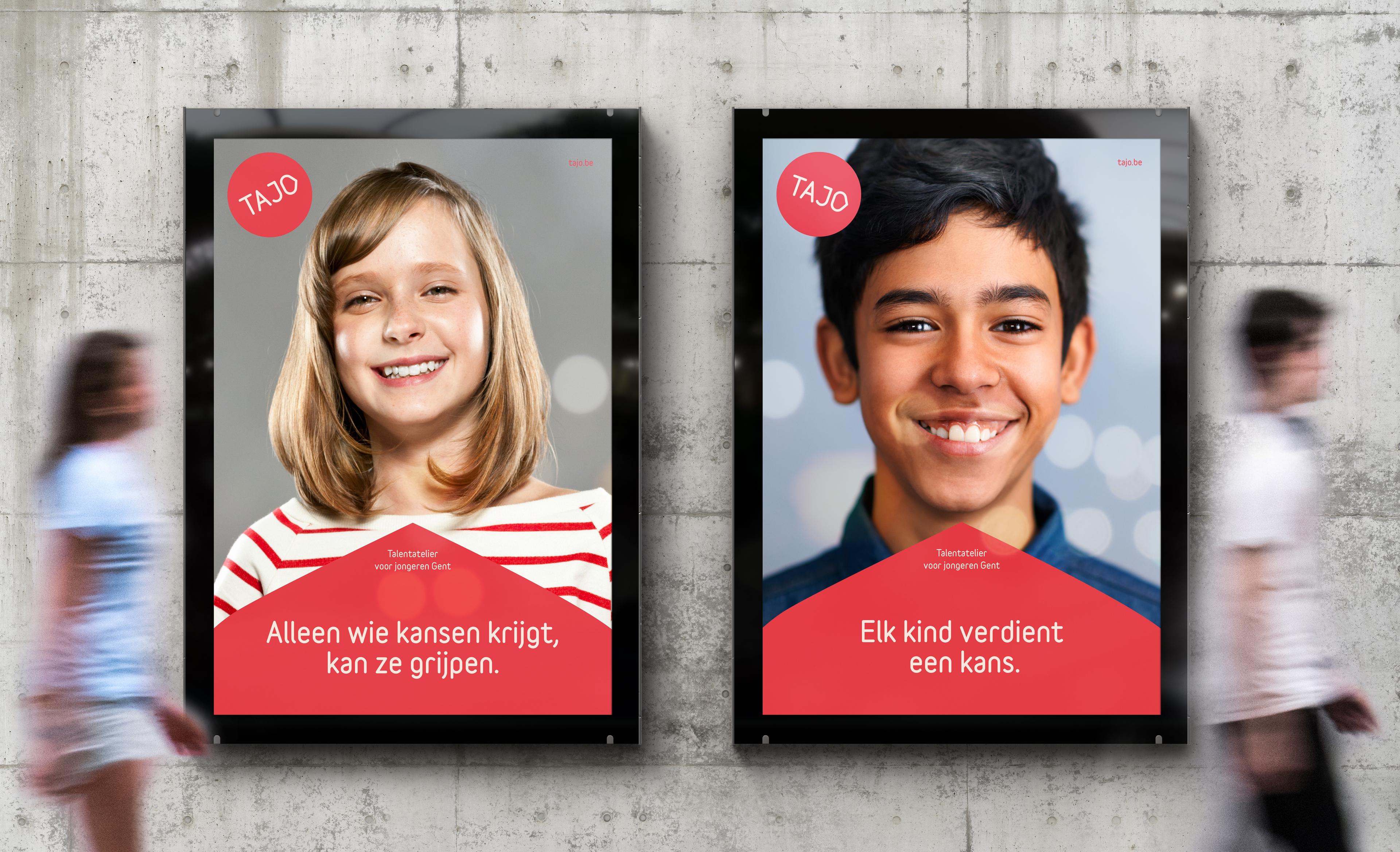
We decided to keep things simple and approachable, so the communication tools are easy to use. The TAJO logo can be read in several ways. The O is a heart and a face, and it points the way forward. It also works as a graphic element that strengthens recognition of the brand. The typeface Variable has a welcoming, rounded feel that speaks to the different TAJO stakeholders. The primary colour is red, with an unmissable signaling function. A limited range of lively secondary colours supports it. For the imagery, we focus on the main actors of the project: the students.
What did we create?
We developed the visual and verbal brand identity for TAJO. It is built around the logo with its O, the Variable typeface, a red primary colour and a limited set of secondary colours. The imagery shows the students: youngsters of both sexes, with different social identities, often from disadvantaged neighbourhoods. Some look proudly straight into the camera, future-oriented. Others are shown in action during the TAJO sessions. The images are bright and colourful, with a positive feel that fits the idea and attitude of TAJO. The identity speaks to the sponsors, the local authorities and the youngsters who need the support most.