nexuzhealth
A fresh new flow for the healthcare of tomorrow

We realigned the overarching nexuzhealth brand and then tackled the audiences step by step. The result is a clear structure for the platforms, a recognisable visual style and sharper employer branding.




The story behind the work
What was the challenge?
nexuzhealth is Belgium's chart-topper in electronic health records and the solutions that come with them. The company helps many care providers move from a maze of data to a collective platform where they can collaborate. It is the fastest-growing company in its field, with more growth on the agenda. That strategy deserved equally solid branding. We first had to realign the overarching brand, after which we tackled the audiences one by one. Care providers needed extra clarity: to get them excited about centralised care, we had to avoid an overdose of information. The growing range of platforms and target groups also had to be shown in an orderly way. And to find IT professionals, who get approached often, the employer branding needed fine-tuning.
What choices did we make?
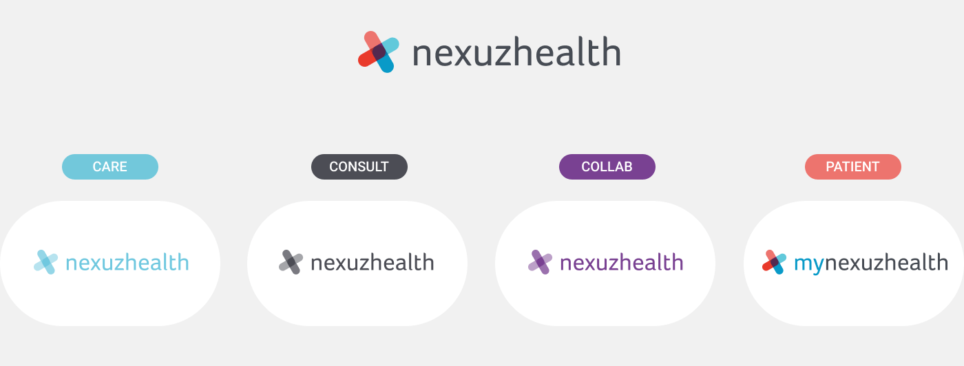
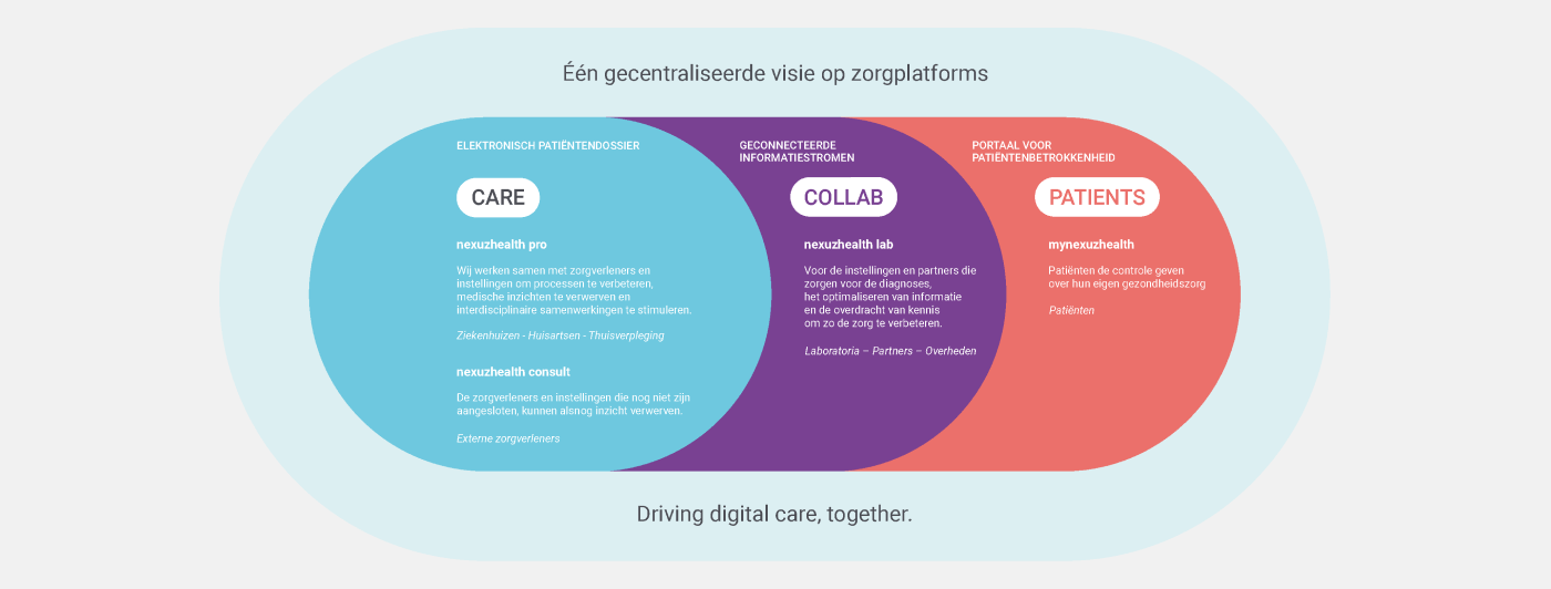
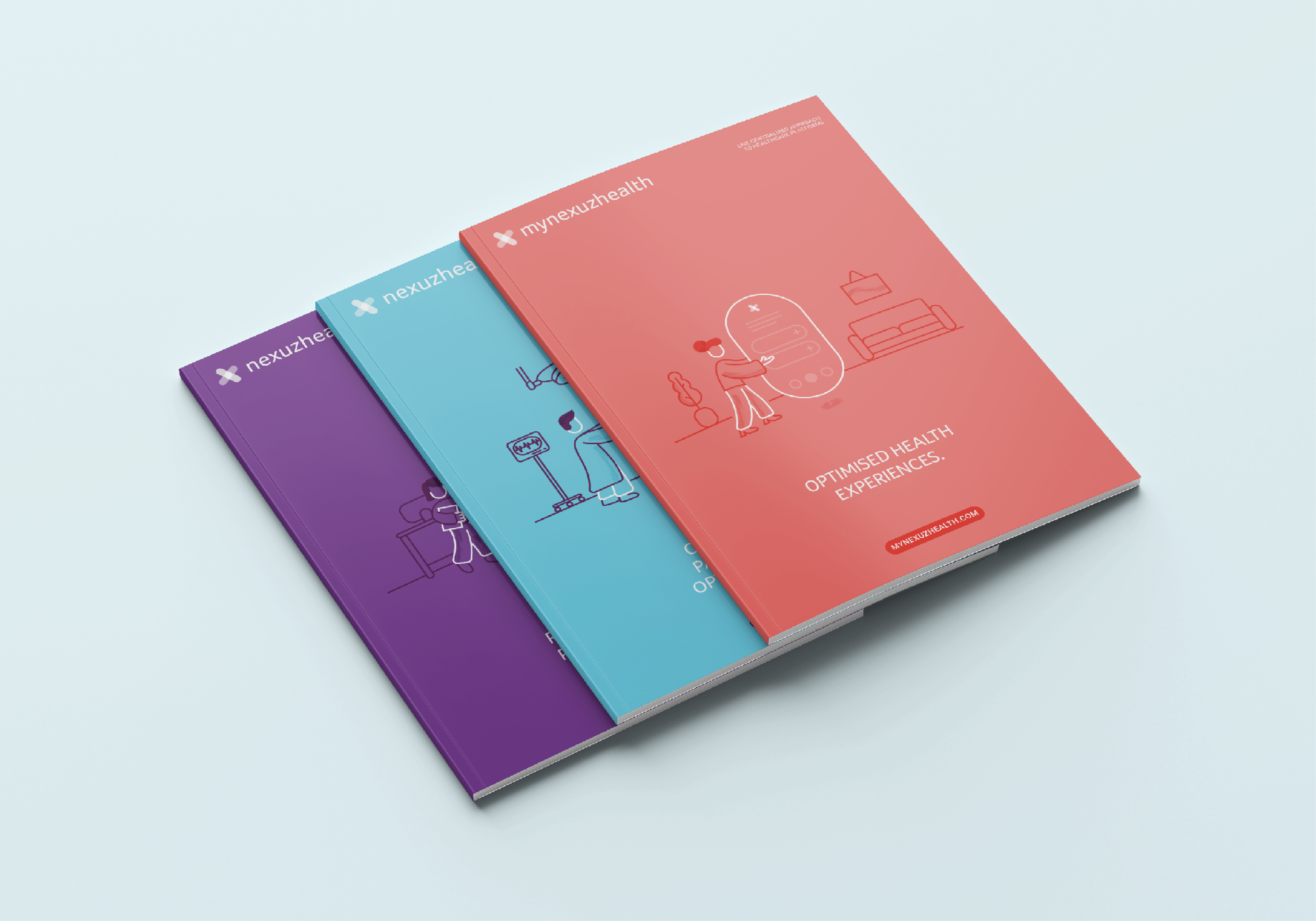
We started with a comprehensive look at the brand. Every word had to fit the story and the target audiences. For care providers we chose clarity and straightforwardness, so that paperwork and hours of research are a thing of the past and the caregiver has more attention for the patient again. After several brainstorm sessions with both teams, we grouped the target groups under four products: care, consult, collab and patients. The three platforms got three colours: blue, purple and soft red. The electronic health record for patients is the beating heart of the operation, so it is positioned around the other three elements like a warm hug. For the illustrations we chose one central approach: the technology always stays in the centre at the same size. Only the environment and the people change.
What did we create?
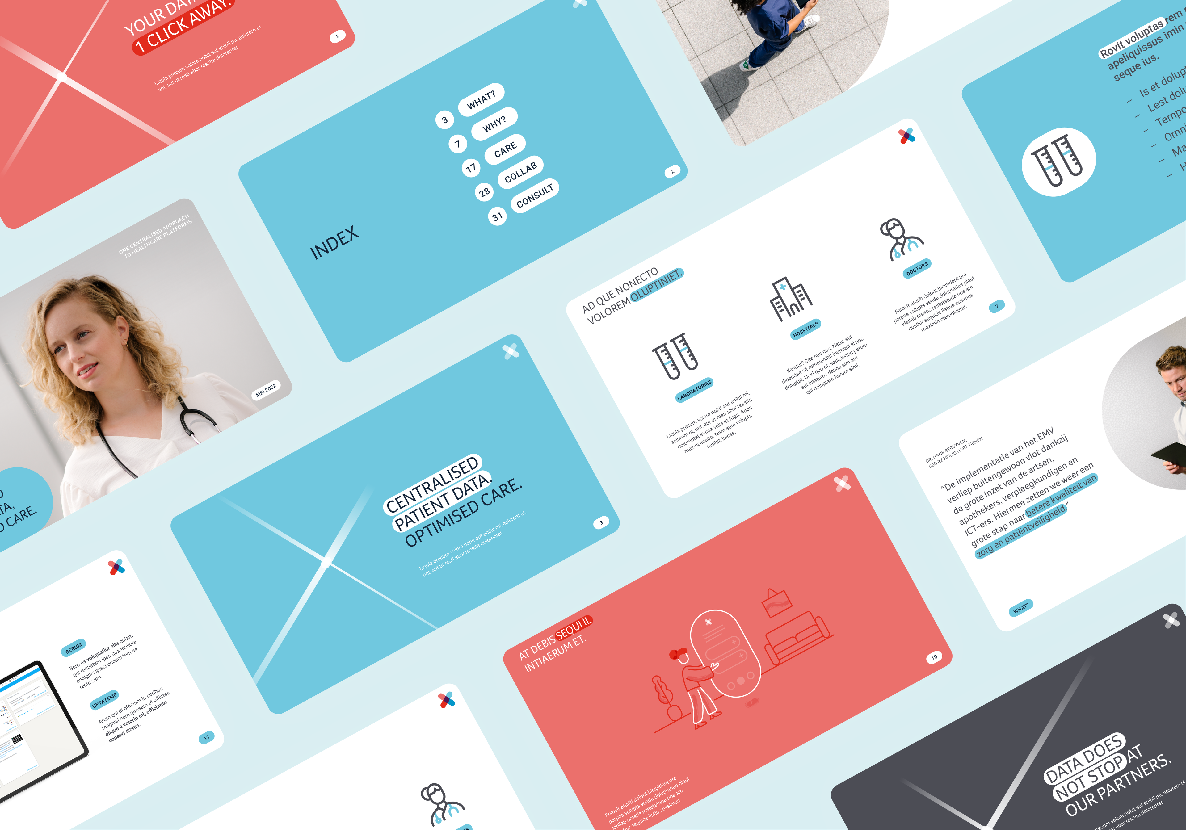
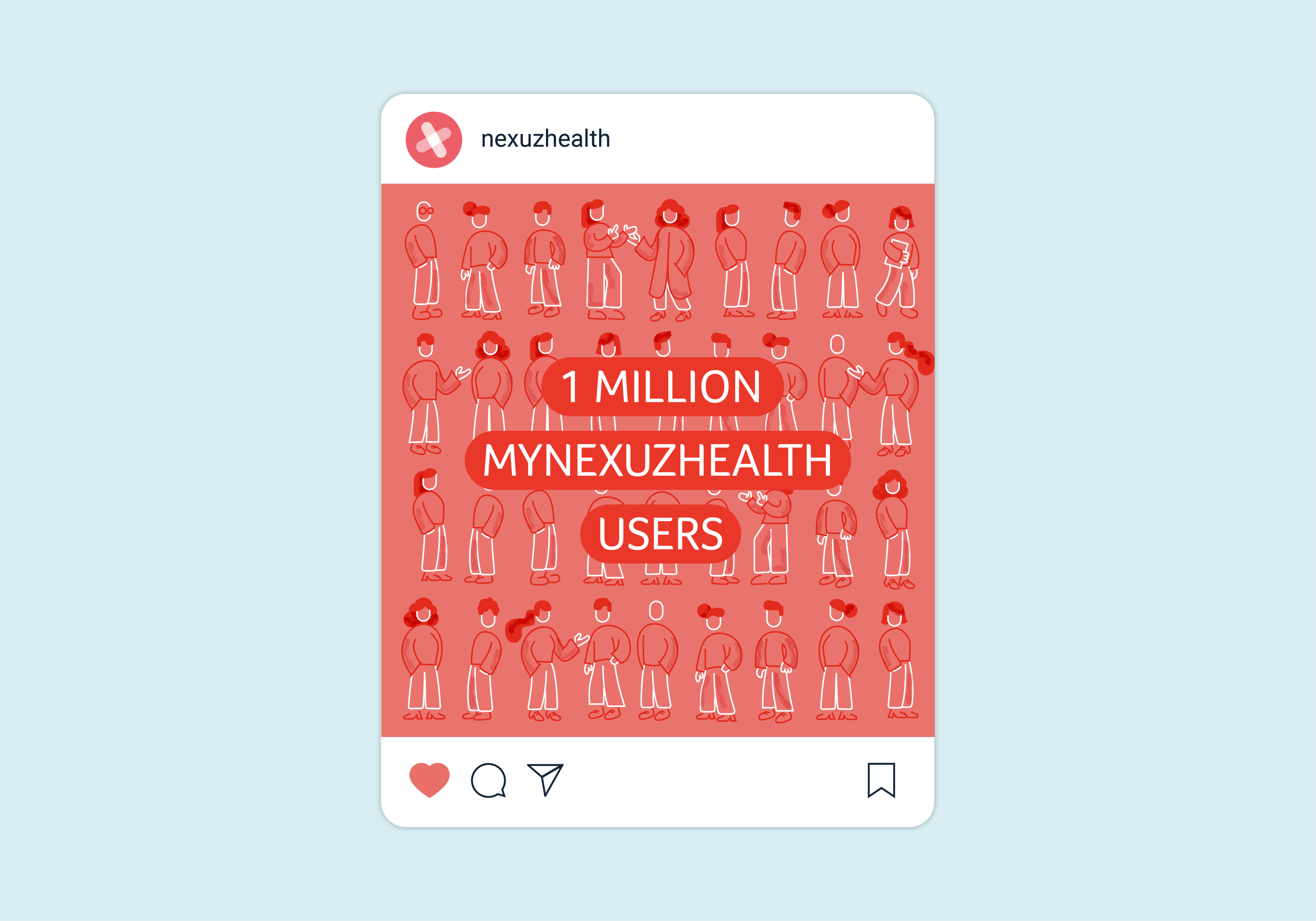
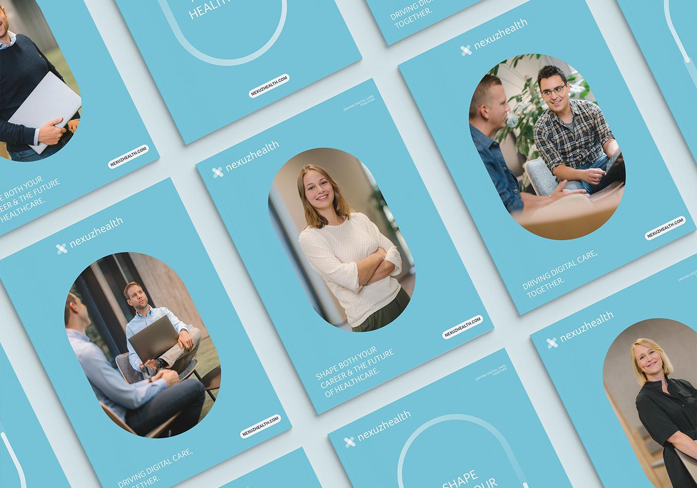
We reshaped the communication strategy and the overarching brand, then worked through the audiences step by step. The overview of platforms and target groups relies on umbrella concepts and colour. To give the stock photography a personal touch, we organised a shoot for the key images. Straightforward guidelines define the dos and don'ts of the visual style. When it suits, we add a graphic element to the photography: the Junction, an eye-catcher that highlights technology and connection. The illustrative style supports the sometimes more serious or analytical communication and balances the established tone of voice. For the employer branding, aimed at IT professionals, we added a motivational campaign line and tried out new channels. We wanted to do something new and intriguing besides tweaking the must haves.