De Panne
A different perspective to change perception
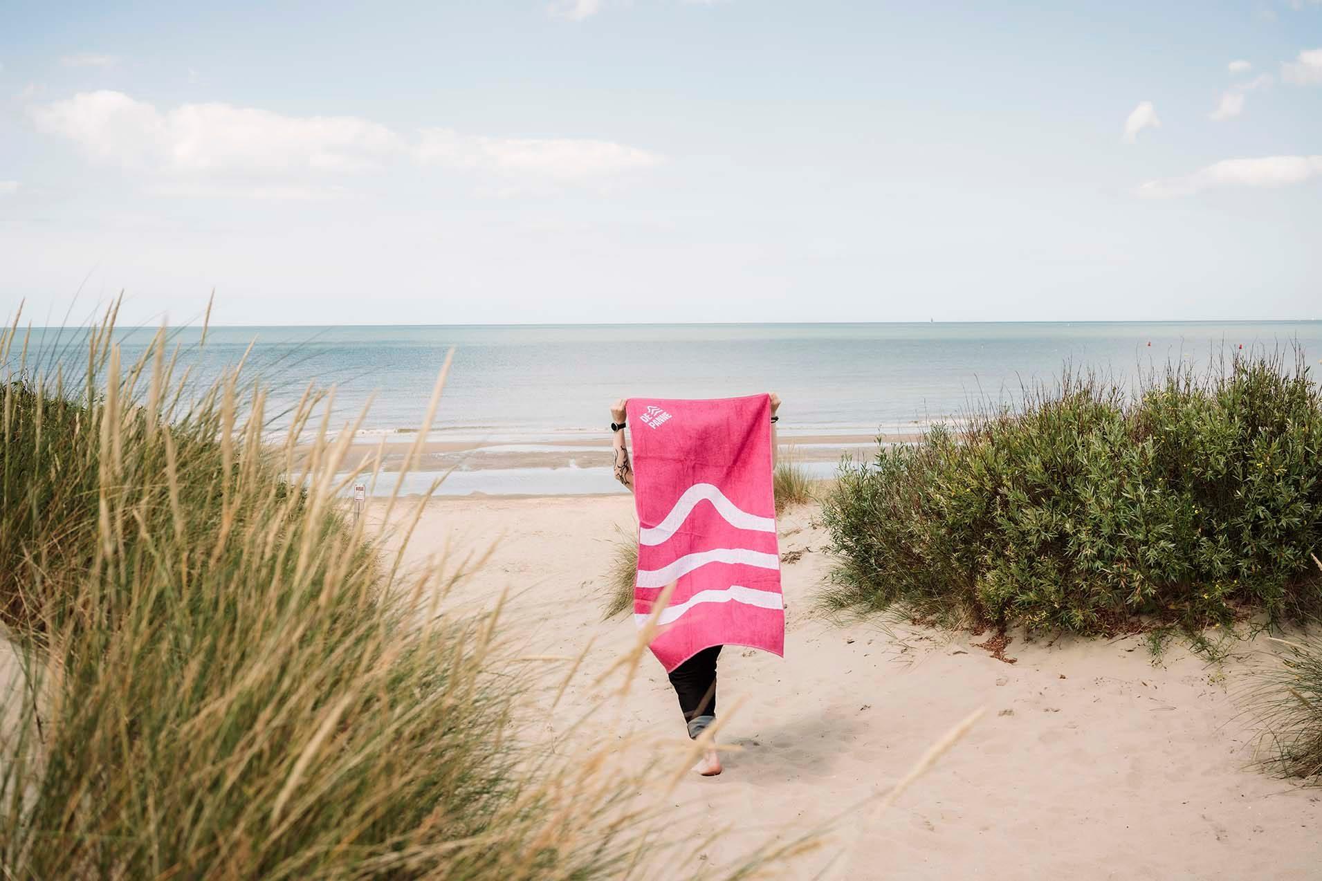
We rebranded the Belgian seaside community De Panne around its location. At the western tip of the country, De Panne is a starting point, and the identity says so: this is where it all begins.






The story behind the work
What was the challenge?
De Panne is a seaside community at the western tip of Belgium, right against the border with France. The town council had always worried about that location. They feared it was too far away for domestic tourists. We won the pitch for the rebranding in the middle of the first corona lockdown. The assignment covered positioning, personality, tone of voice, look and feel, animation and activation. The challenge was to change how people see De Panne. The sea and the surrounding nature reserves give residents and visitors plenty of breathing space, and the brand had to make that visible.
What choices did we make?
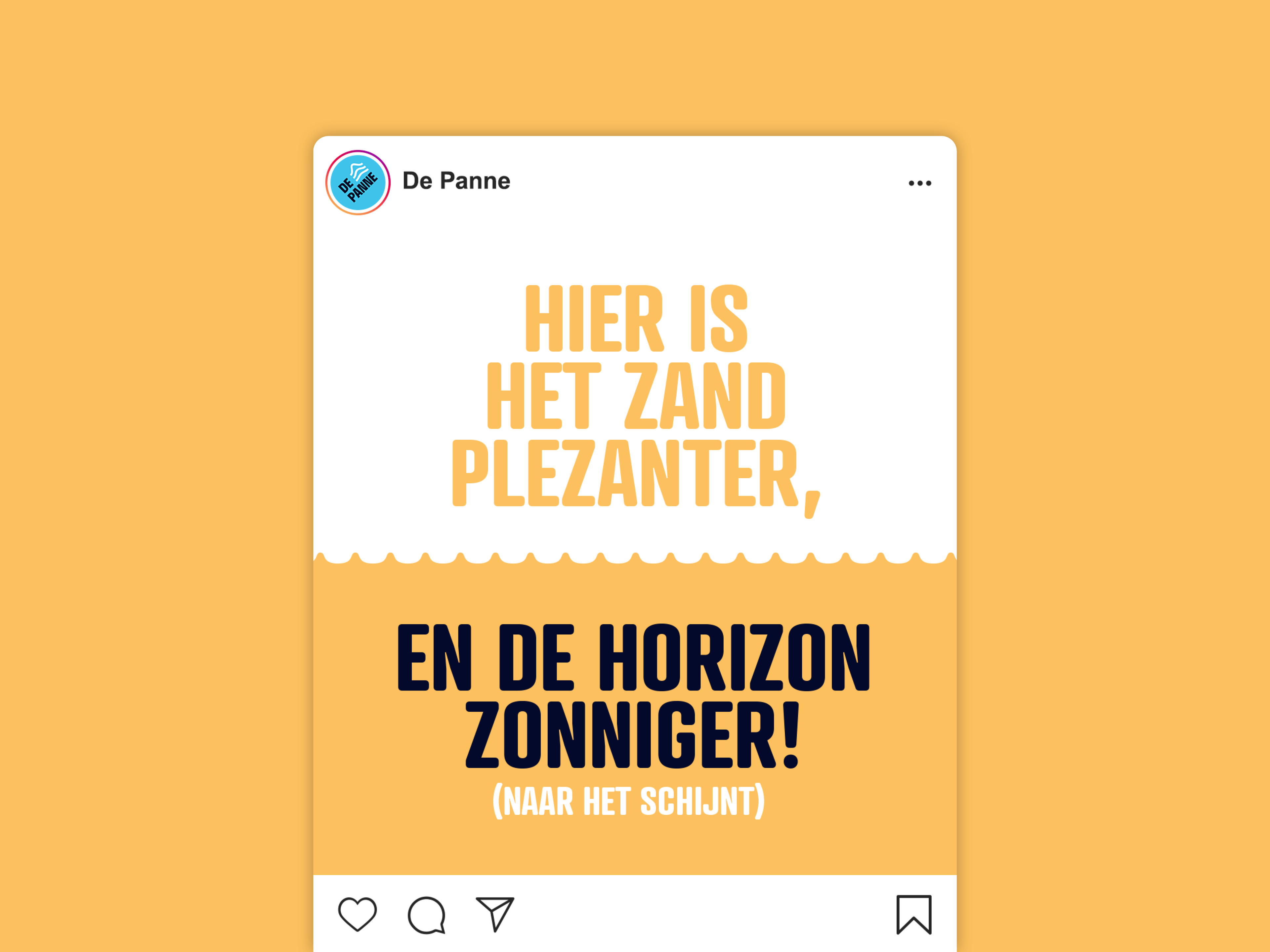
We turned the location into the idea. In a connect-the-dots drawing of Belgium, De Panne would be "1". It is also where King Leopold I first set foot in 1830. That gave us the positioning "this is where it all begins": fresh air for a fresh start. De Panne becomes a starting point for a holiday, a business or a family. Every part of the identity, from tagline to logo to graphic elements, is rooted in De Panne itself. The tagline plays on a Dutch idiom that means "to create fun" and literally says "to dig fun". It refers to the widest beach of all Belgian seaside resorts, and it can adapt to its context. Nobody wants "have fun" on a letter about local taxes. We also worked closely with the in-house communications department.
What did we create?
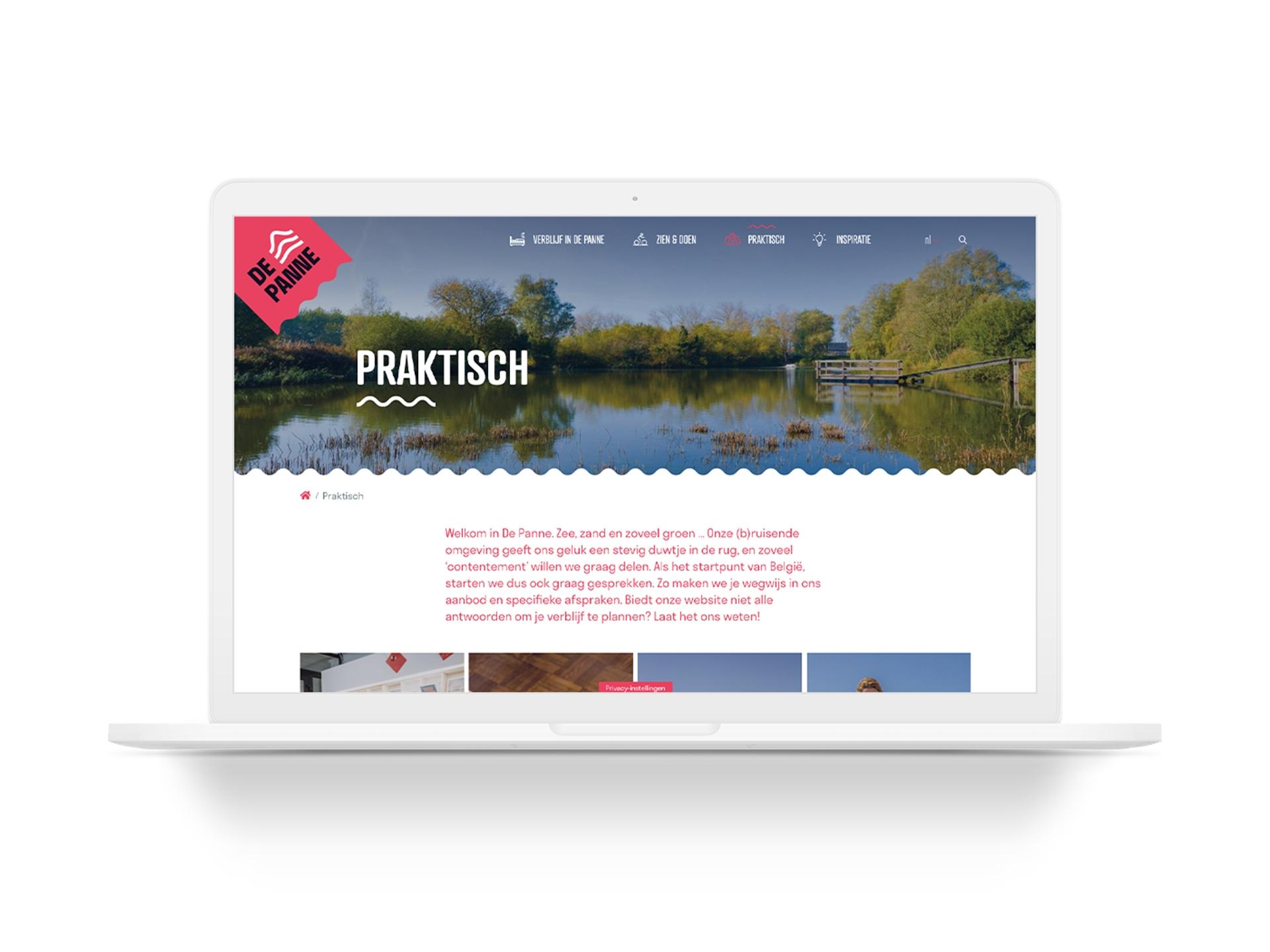
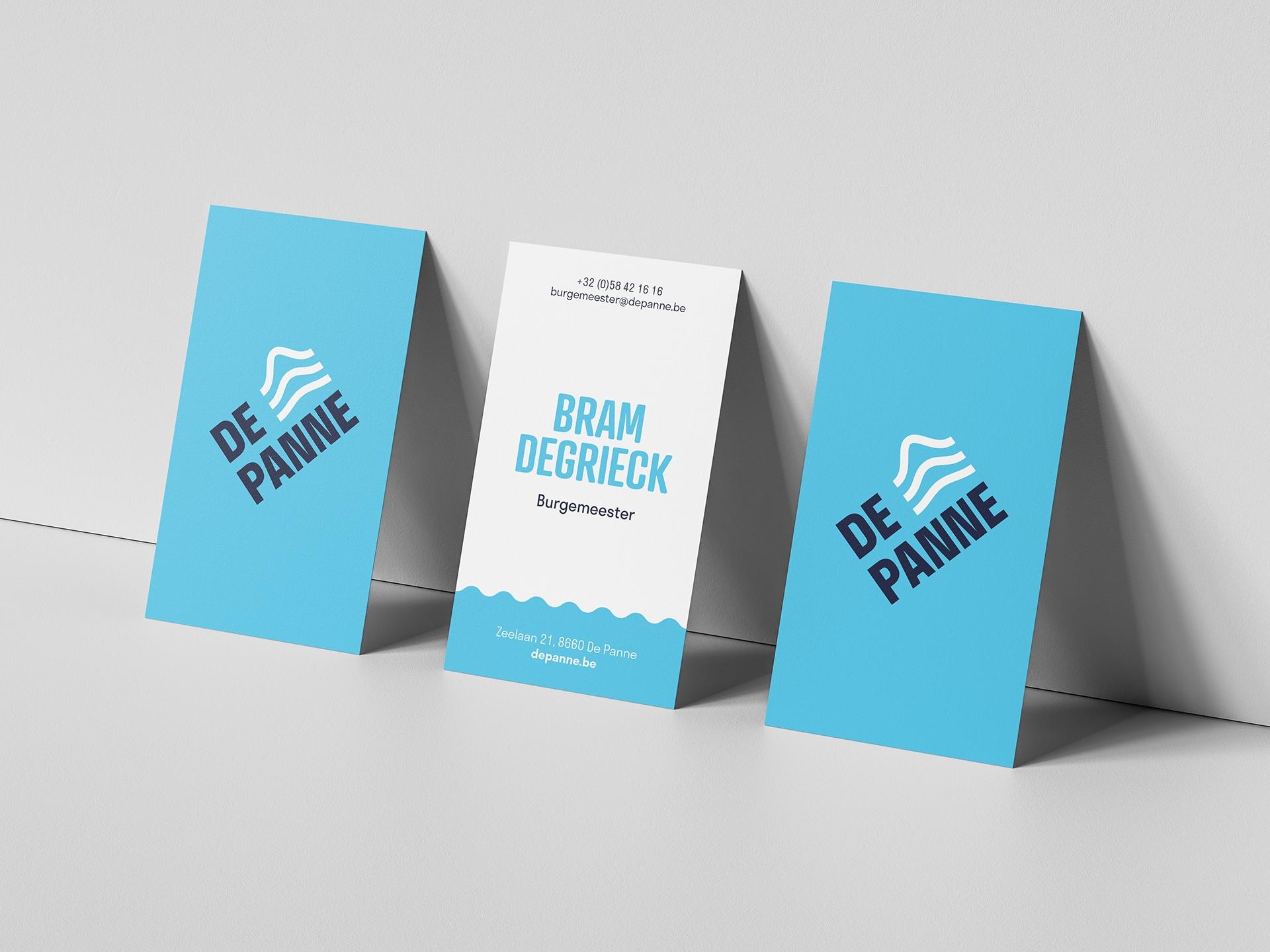
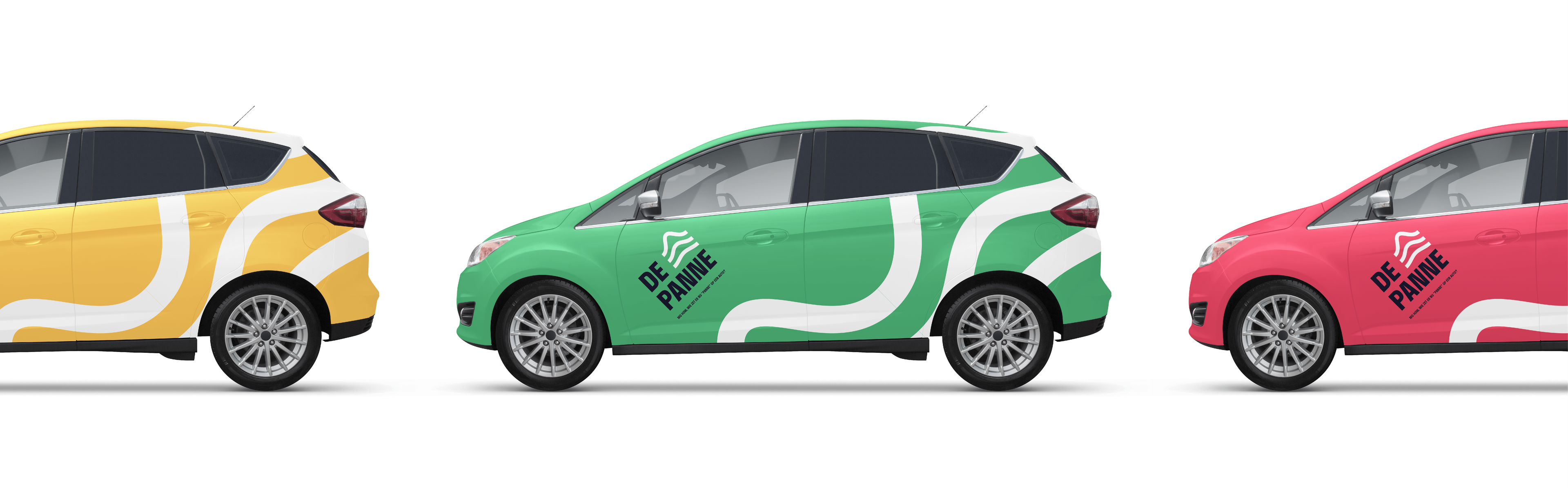
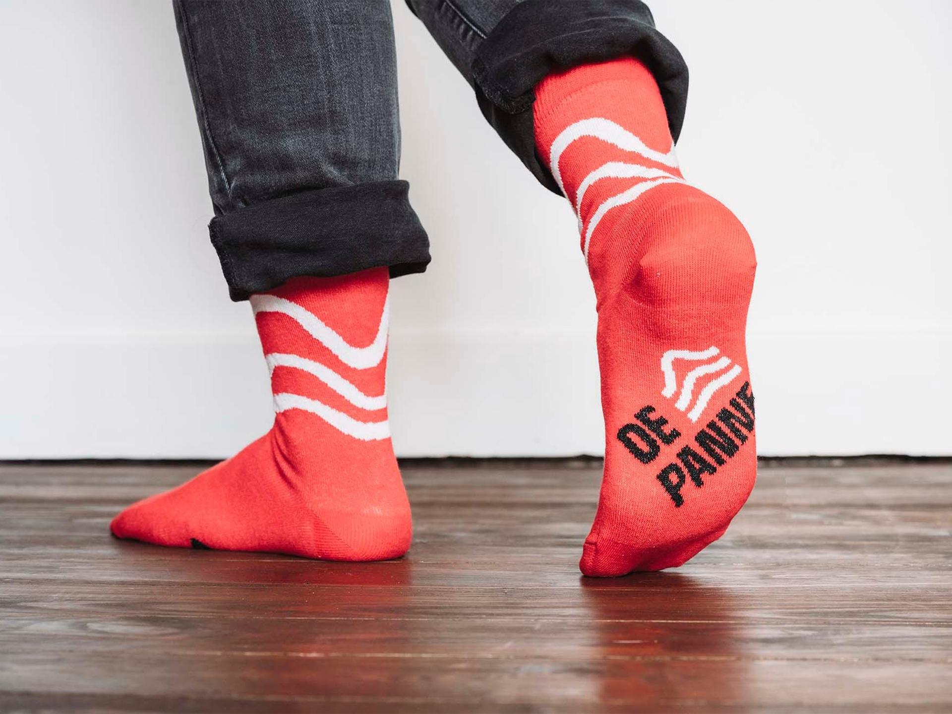
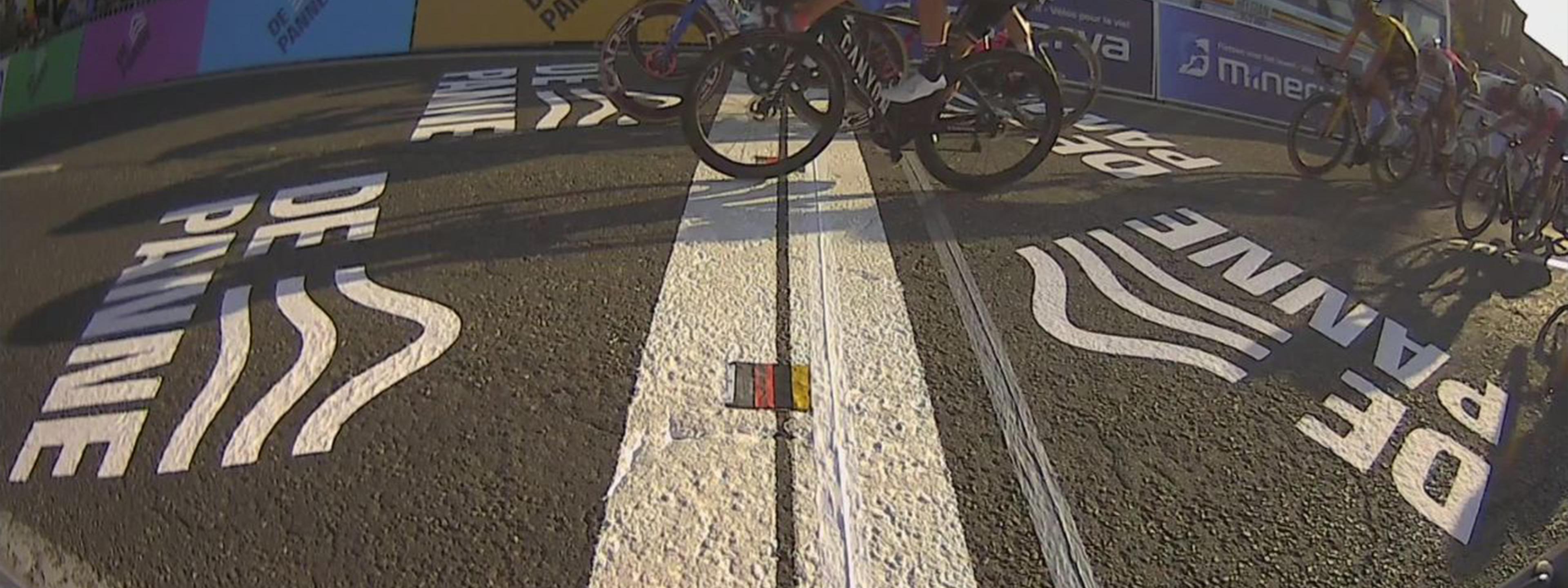
The logo is tilted at 45°. It directs your attention to the top left corner, exactly where De Panne sits on the map. The lockup of logotype and brandmark is a perfect square. Because the wind blows fiercely here, we chose a sturdy, storm-proof font in capitals. The waves of the brandmark show the topography: the rugged North Sea, the pristine dunes and the fruitful pasturage. The brandmark also works as a rolling pattern that recalls both the sea and a royal crown. The palette keeps De Panne's warm heritage colours, such as Cotton Candy Purple, Dew Blue and Factor 50 Red, and adds colours to complete the rainbow. Our dune research led to abstract shapes and patterns, wavy lines on the logo container and flexible frames for images and messages. We developed the guidelines and first applications with the in-house communications department, and added a bottle of sunscreen to the guidelines.