Compaxo
Tastefully Honest Tradition
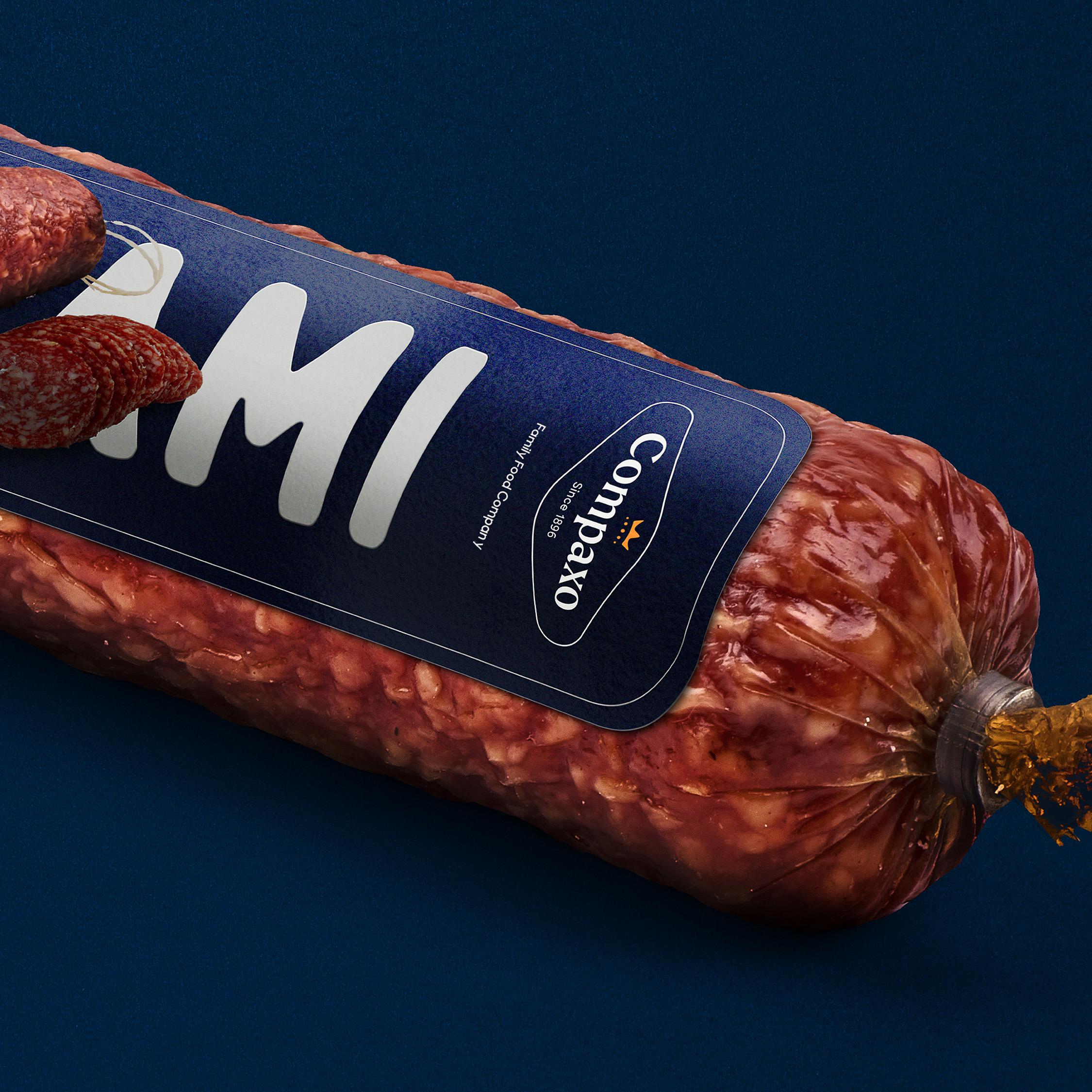
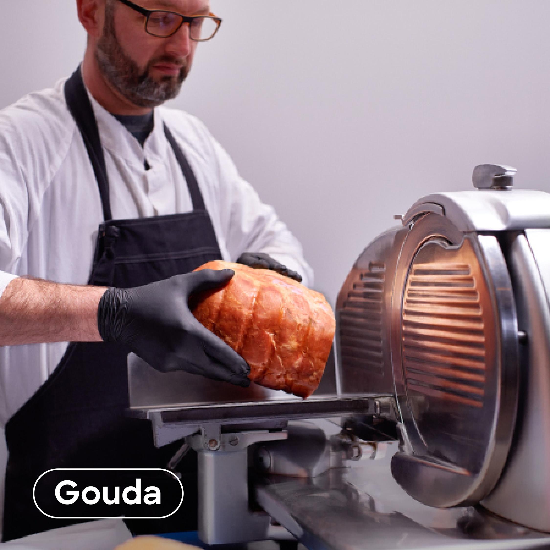
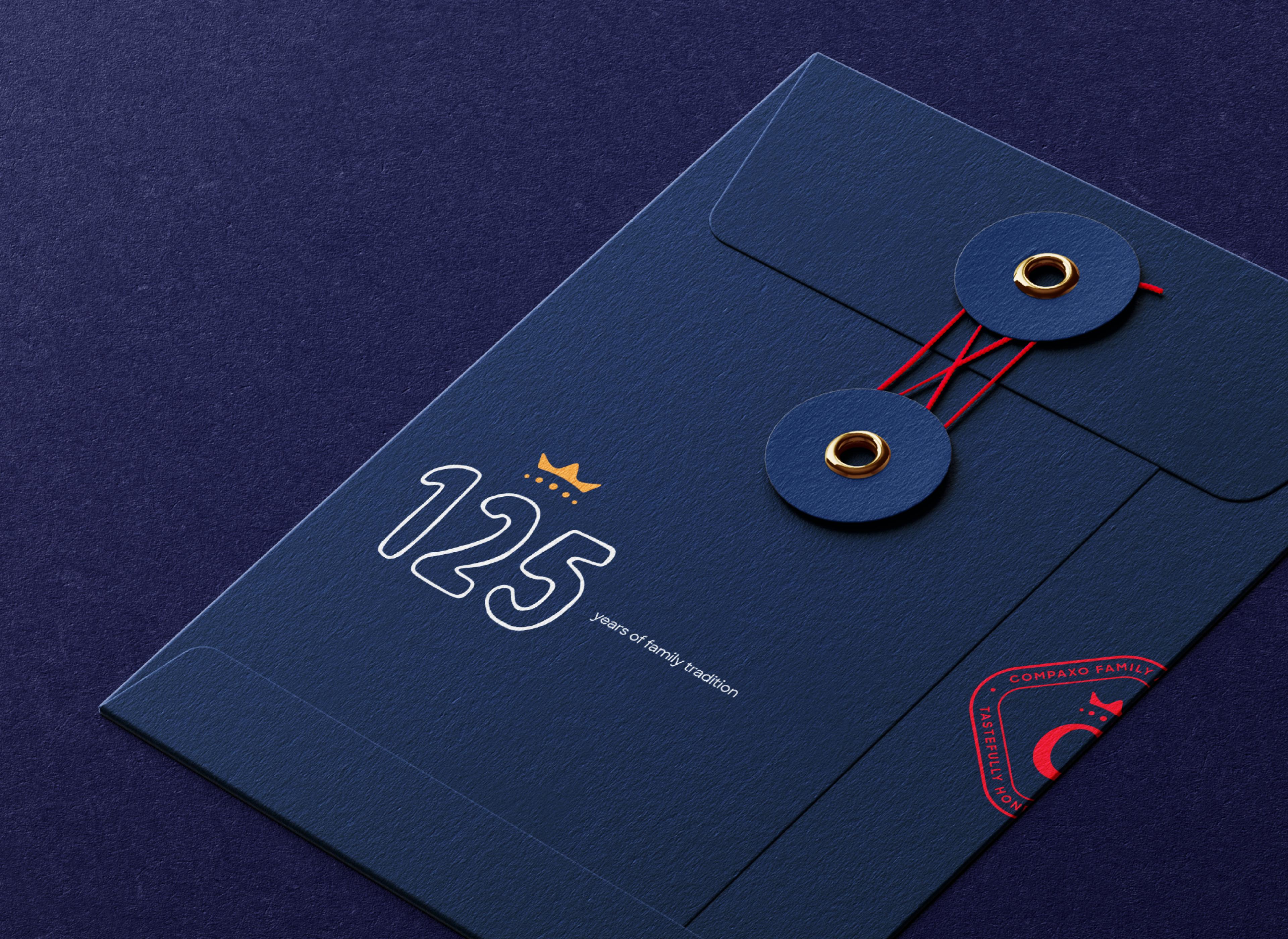
Compaxo is a family food company, founded in 1896 in Gouda. For its 125th anniversary we gave the company one clear brand and one website for its two locations.









The story behind the work
What was the challenge?
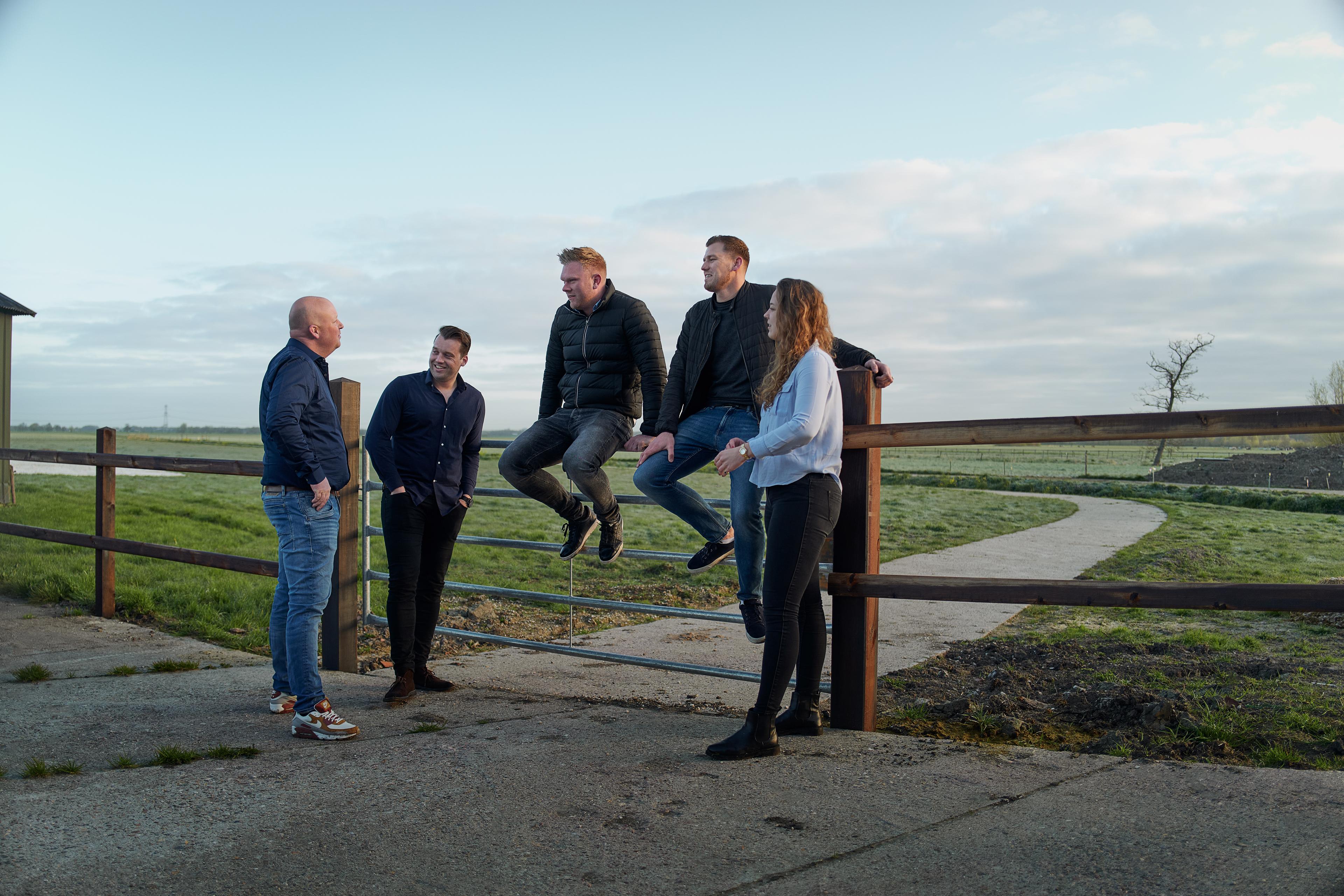
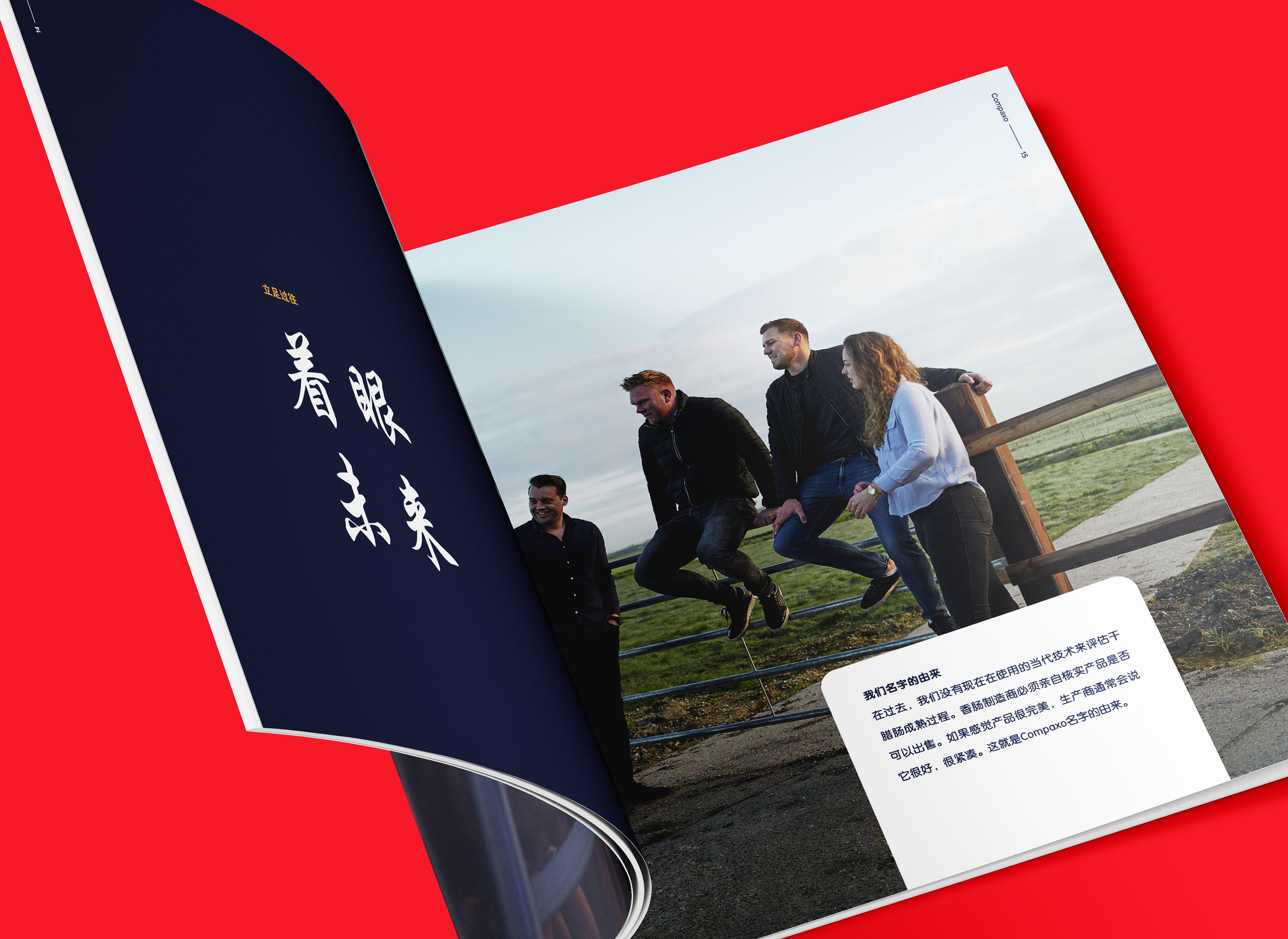
Compaxo was founded in 1896 in the centre of Gouda. On the occasion of its 125th anniversary, the family wanted to set a clear and coherent course for the future and to communicate its core beliefs and values as one strong unity. Over the decades the business grew in many directions. That led to two prime locations, Zevenaar and Gouda, each with its own specialisations. At that time each site also had its own website and its own communication. This disconnection, combined with a shared desire for strong, unified external communication, called for several in-depth exercises to reconnect the sites. Our cooperation started with the assignment to compose and communicate the anniversary book, because the newest generation wanted to try a different approach.
What choices did we make?
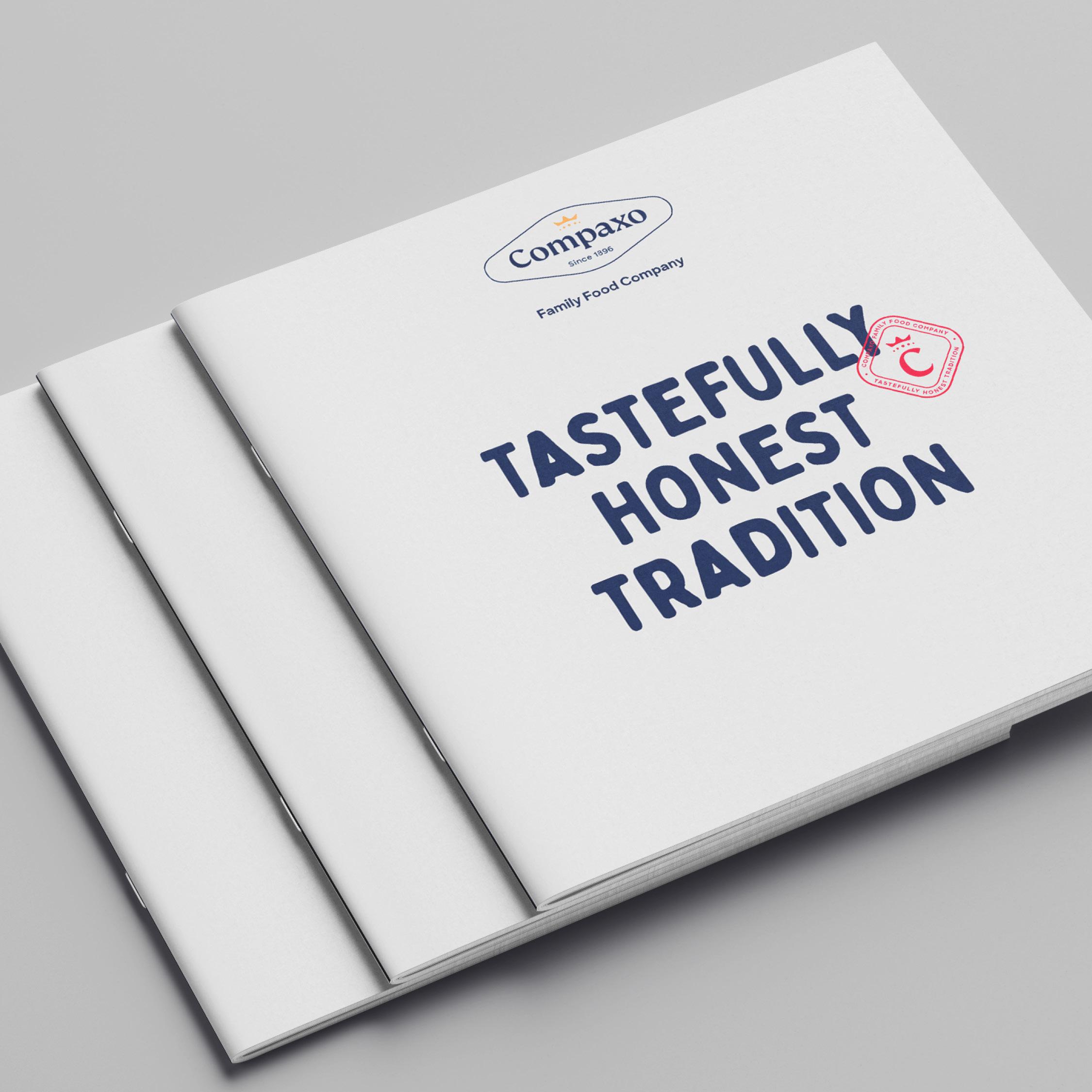
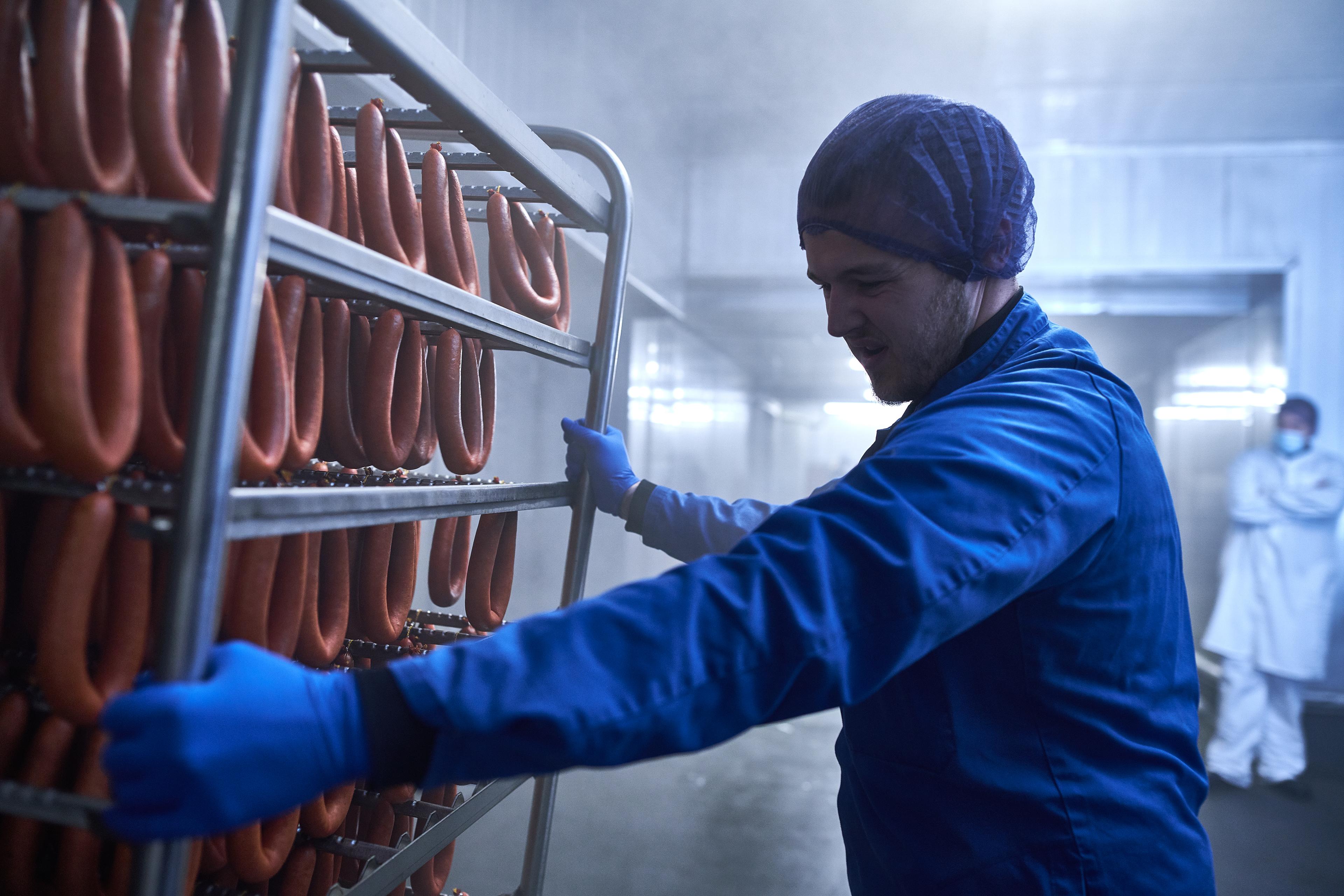
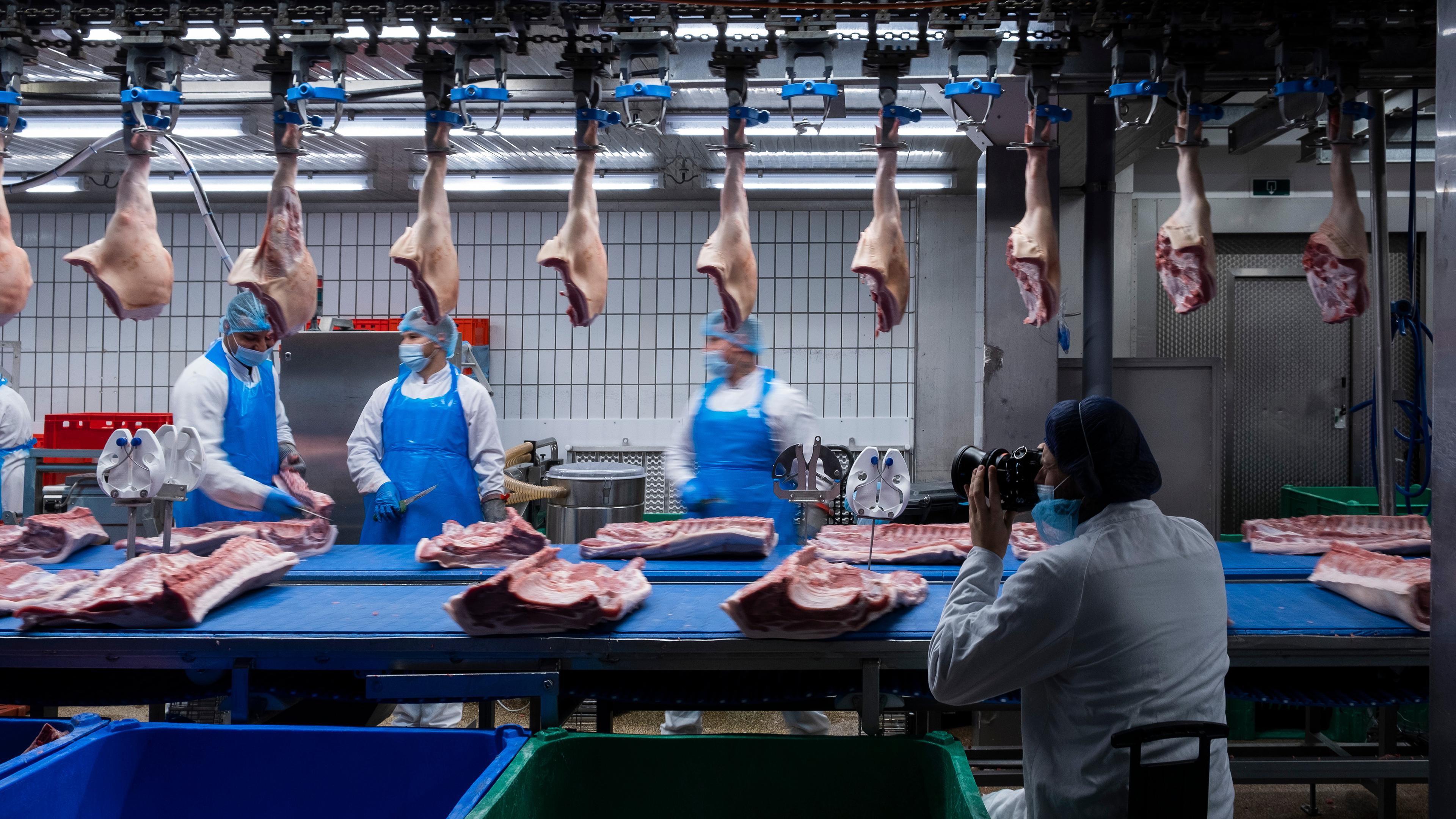
After the workshops and sufficient research, we chose a corporate perspective in which the two branches are part of the chain. Compaxo's most distinctive aspect is its A-to-Z control over that chain, from farmer to delivery. We emphasised this unique selling point to the full, so the target audience is drawn into the Compaxo story and its impact on the meat and meat-free market in Europe and beyond. With our concept of meaningful brand engagement in mind, we proposed a full branding project instead of a single book. By digging deeper, we presented what the family truly required next to what they asked for. The tagline and the nominator keep it simple: "Tastefully honest tradition" and "Family food company". Together they are two times three words.
What did we create?
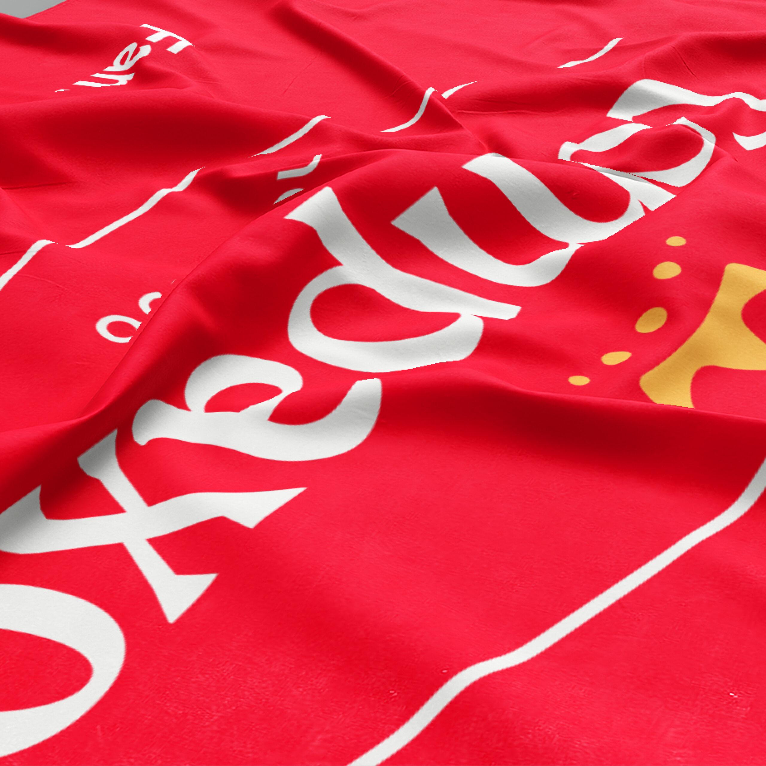
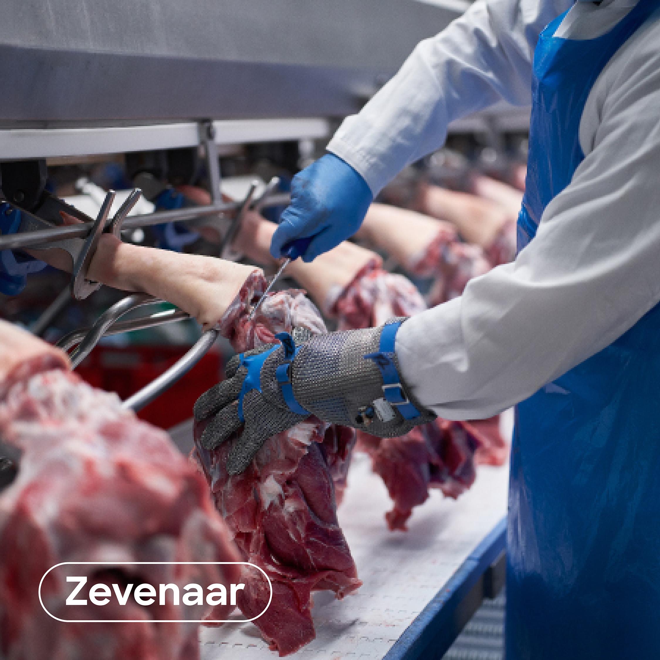
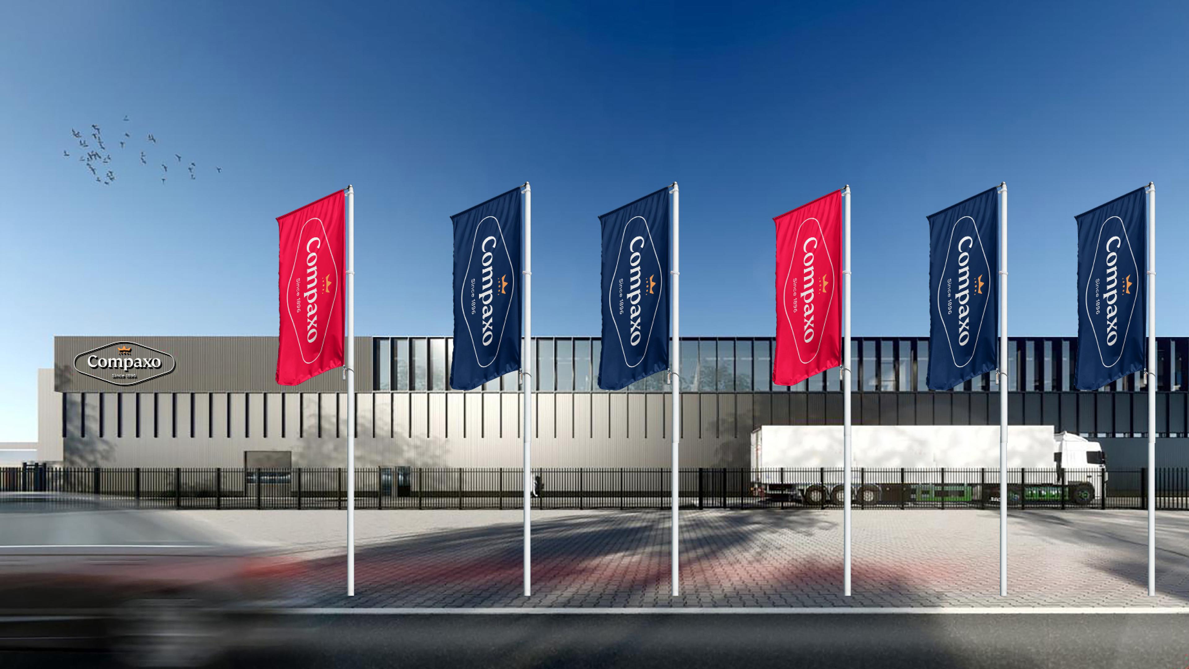
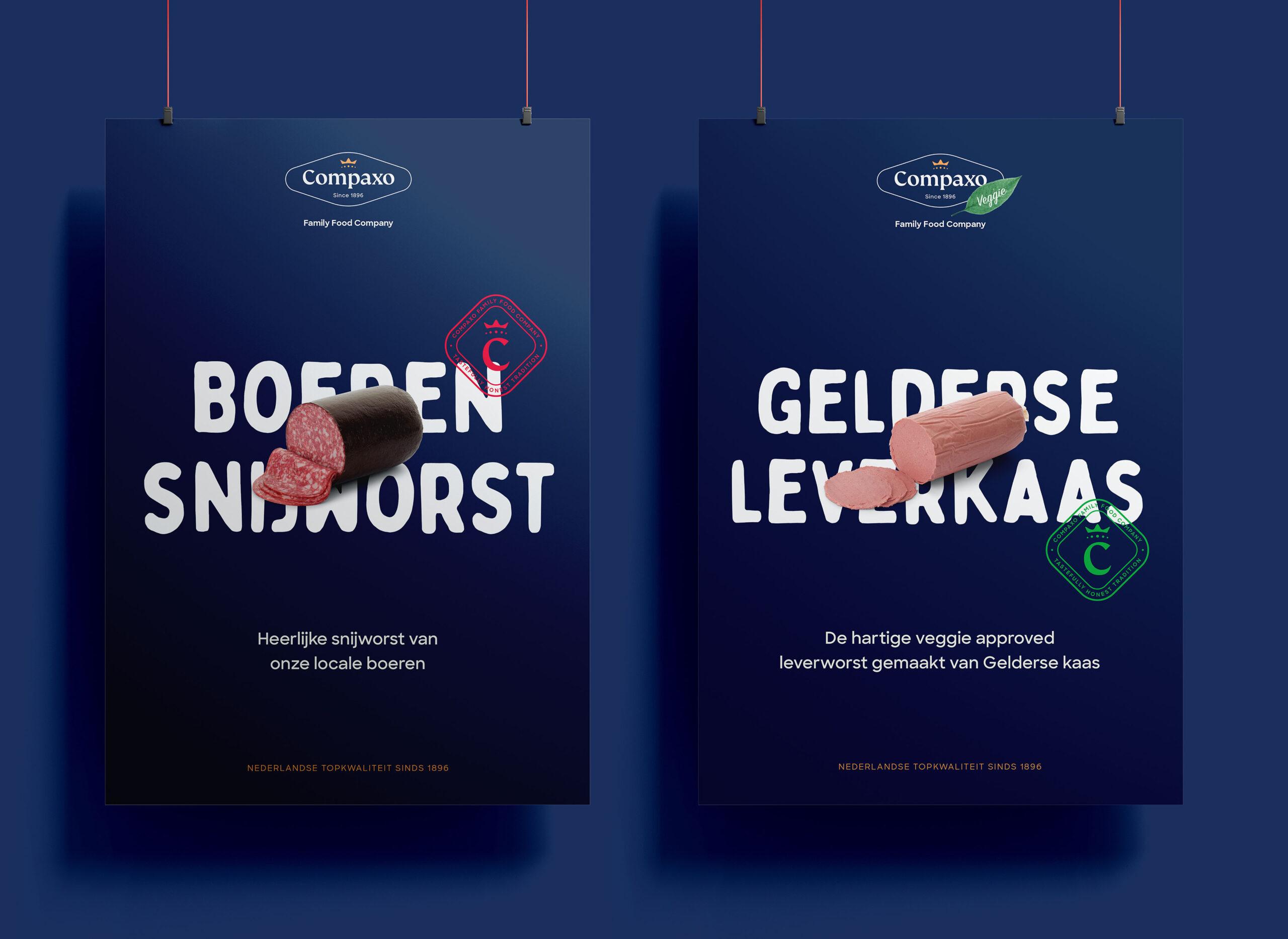
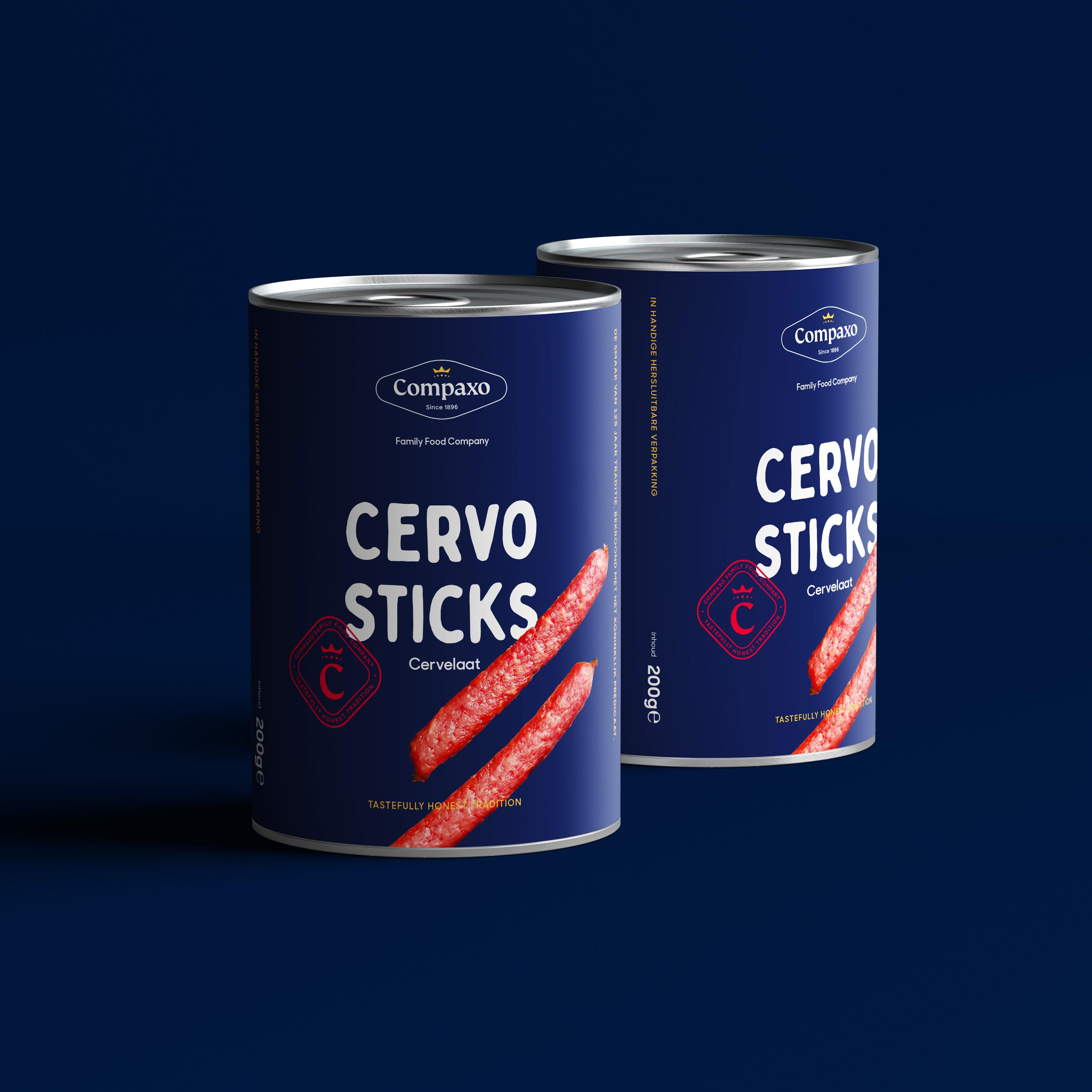
We refreshed the corporate logo. It fits modern times and keeps the connection to the family's heritage. Three product groups got their own logo: fresh pork meat, cured meat and vegan & veggie products. The cured meat logo belongs to the Gouda branch, the veggie & vegan logo has a leaf added, and fresh pork meat, part of the Zevenaar branch, has a red logo. The tagline reflects the family's heritage and straightforward character, which has won the respect of stakeholders for centuries. The nominator gives new customers and third parties extra clarification. One website replaces the two original ones. The homepage presents the general story and the main USPs before visitors move on to the product range for their market. Where needed, it distinguishes between Zevenaar and Gouda. For the brochures we took everything apart down to the last page. A general folder holds the corporate information, so the other brochures no longer repeat it. It also works as a folder for all leaflets and papers.