Broes Ingredients
A question of quality

A rebranding for the family company Broes Ingredients, built on reliability and reassurance. A new tagline, a logotype with a vintage feel, a colour code and a graphic element called the Binding Agent put the human factor in view.



The story behind the work
What was the challenge?
Uncompromising quality in food products starts with total control. Broes Ingredients knows that this takes full transparency in the supply chain and a personal approach in every partnership. Over three generations, the family company has outgrown the role of simple intermediary. Even when the conversation turns to E numbers, the human factor leads it.
The brand needed to make that direct communication possible. Its promise reads: “We bridge the gap between professional partnerships and personal relationships; between long-term alliances, a proactive approach and day-to-day agility; between real-time monitoring and just-in-time deliveries. We master the entire process to make products better, checking off complete shopping lists and preserving peace of mind.” The rebranding had to carry that promise, with reliability and reassurance at its core.
What choices did we make?
If the brand promise is a copious five-course dinner, the tagline is an irresistible snack on the go. With just a few words, it captivates and activates.
For the logotype we chose Gatwick ultrabold. It gives a vintage feel that refers to the rich heritage of the family company. The wide letters with stylish details have a dynamic character that complements the ambitious team.
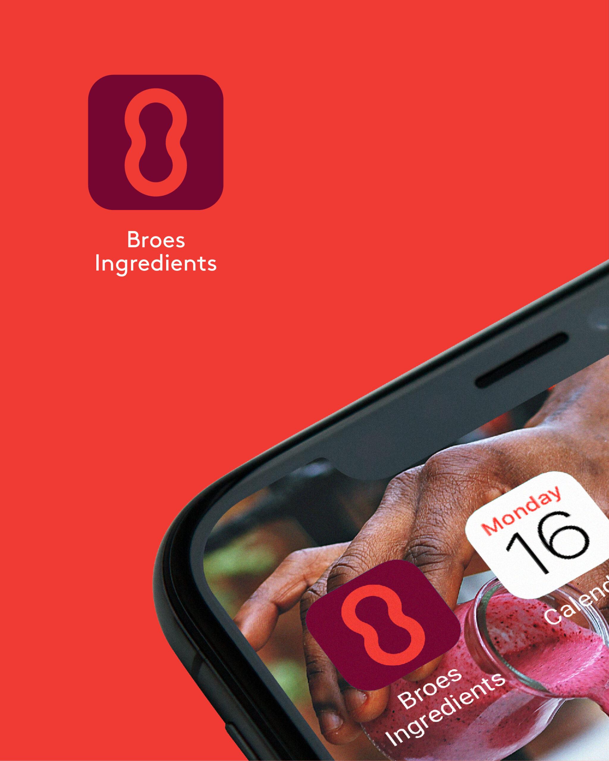
We tend to eat with our eyes, so the logo had to look as appealing as possible. We added colourants. Juicy Burgundy and Tasteful Red are used in a nutritional context, such as ingredients and dishes. Sweet Pea belongs to the logistical context: “We are green and lean!”
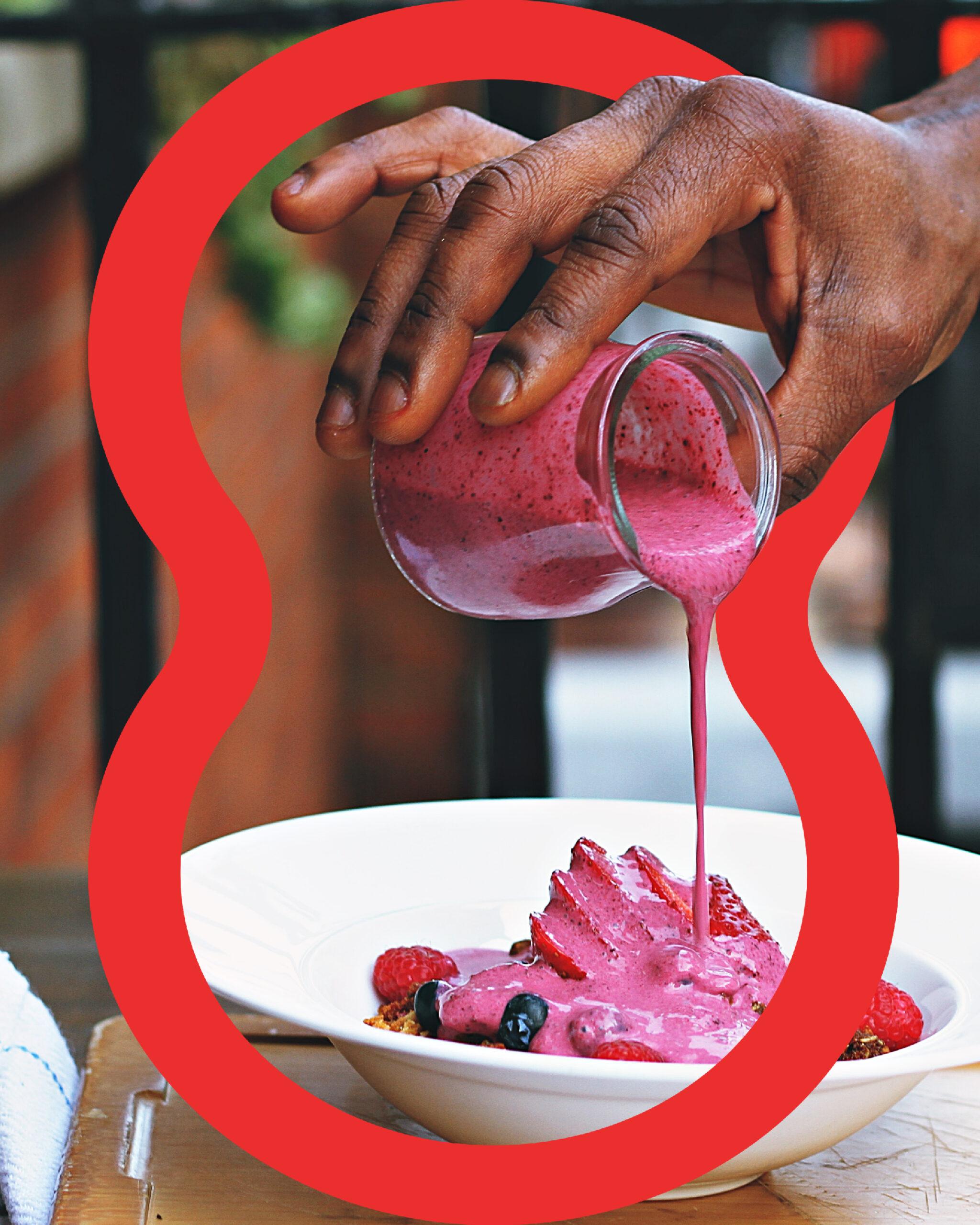
The Binding Agent arranges information and focuses attention. It stands for chemical connections and long-term partnerships. Its smooth, organic shape adds a human value to any design.
What did we create?
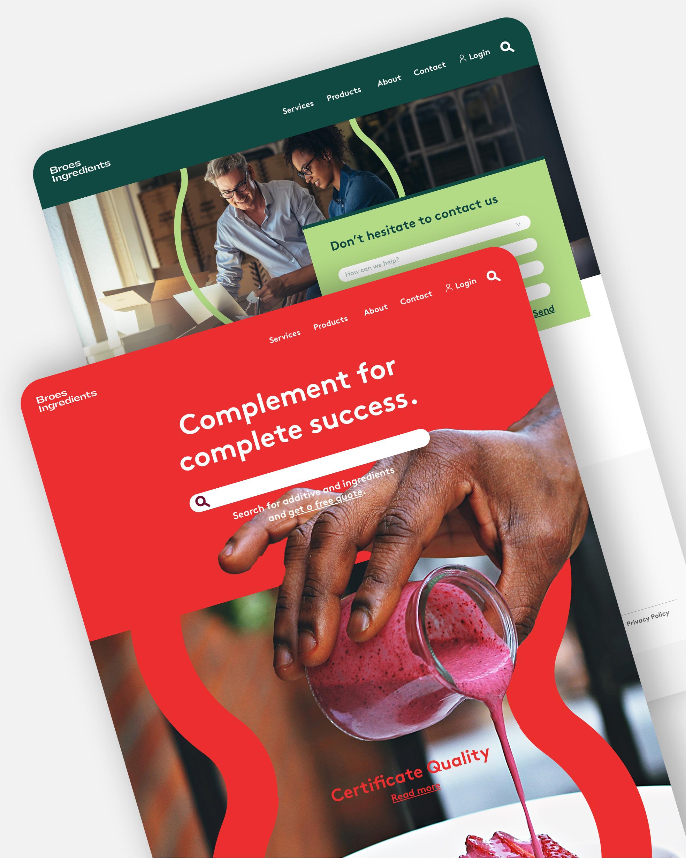
We created a rebranding for Broes Ingredients: a tagline, a logotype in Gatwick ultrabold, a colour palette and a graphic element, the Binding Agent. The Binding Agent has a curvilinear, fixed form with a wide variety of possibilities. It interacts with the imagery, and the thickness of its edges is not limited, ranging from an outline to a solid silhouette. It is as playful as it is functional.
The proof of the pudding is in the eating. The samples show the rebranding in use, with consistency in both design and quality.