Winsol
Warmth the way we want it

Winsol makes doors, windows and sun blinds that help people enjoy their home. We built a brand around that idea, with a warm style, a sunny yellow palette and the tagline "a home to enjoy".




The story behind the work
What was the challenge?
Winsol is a specialist in high-quality doors, windows and sun blinds. For over 140 years it has been building up the Gross National Domestic Happiness in Belgium. The brand wanted to give its branding a new drive.
Winsol creates a home that matches who you are. The brand itself had to match Winsol's personality just as closely. It also had to leave room to grow. Winsol commits to people's happiness and likes to innovate, offering 'the happy few' even more comfort and quality of life.
What choices did we make?
We started with a first strategic exercise. From there we wrote a new brand story and a tagline that sums up Winsol's purpose: "a home to enjoy".
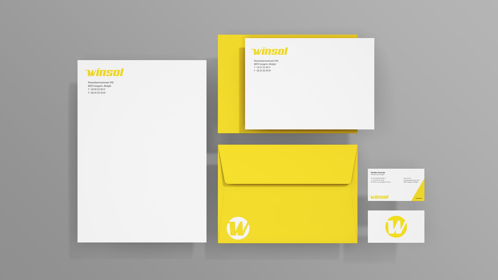
To reinforce the brand fundaments, we developed a contemporary, warm brand style. The renewed logo has the avatar 'W' as a minimal, highly recognisable derivative and radiates hospitality and positivity. The colour palette revolves around the sunny yellow of the corporate identity, just as the earth revolves around the sun. Evocative letters and dynamic graphic elements go together with photography that shows how Winsol brings warmth to every home.
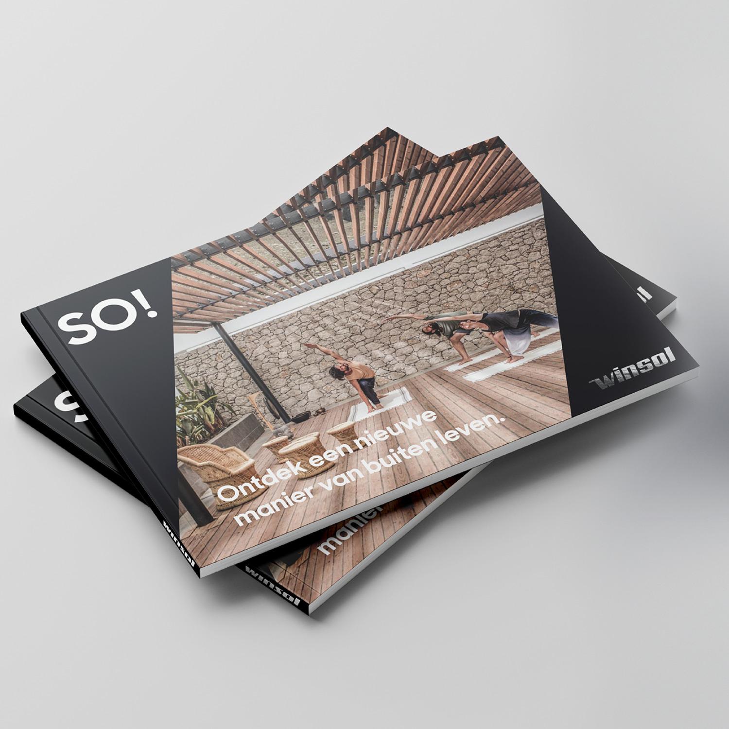
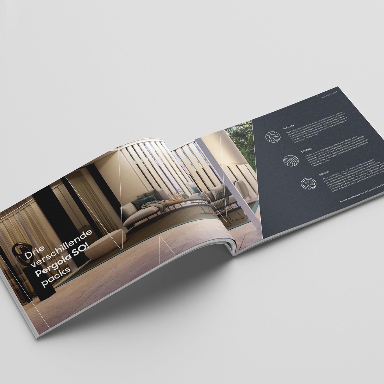
For the premium SO! range we use yellow in moderation, in support of the elegant black-and-white palette. That creates a distinctive class for further expansion, while the warmth of Winsol stays intact.
What did we create?
We made a brand book that answers questions like "What is a home?" and "How does Winsol help you to create your ideal home?". It puts the philosophy of "a home to enjoy" in the spotlight and uses the avatar 'W' as a wayfinder.
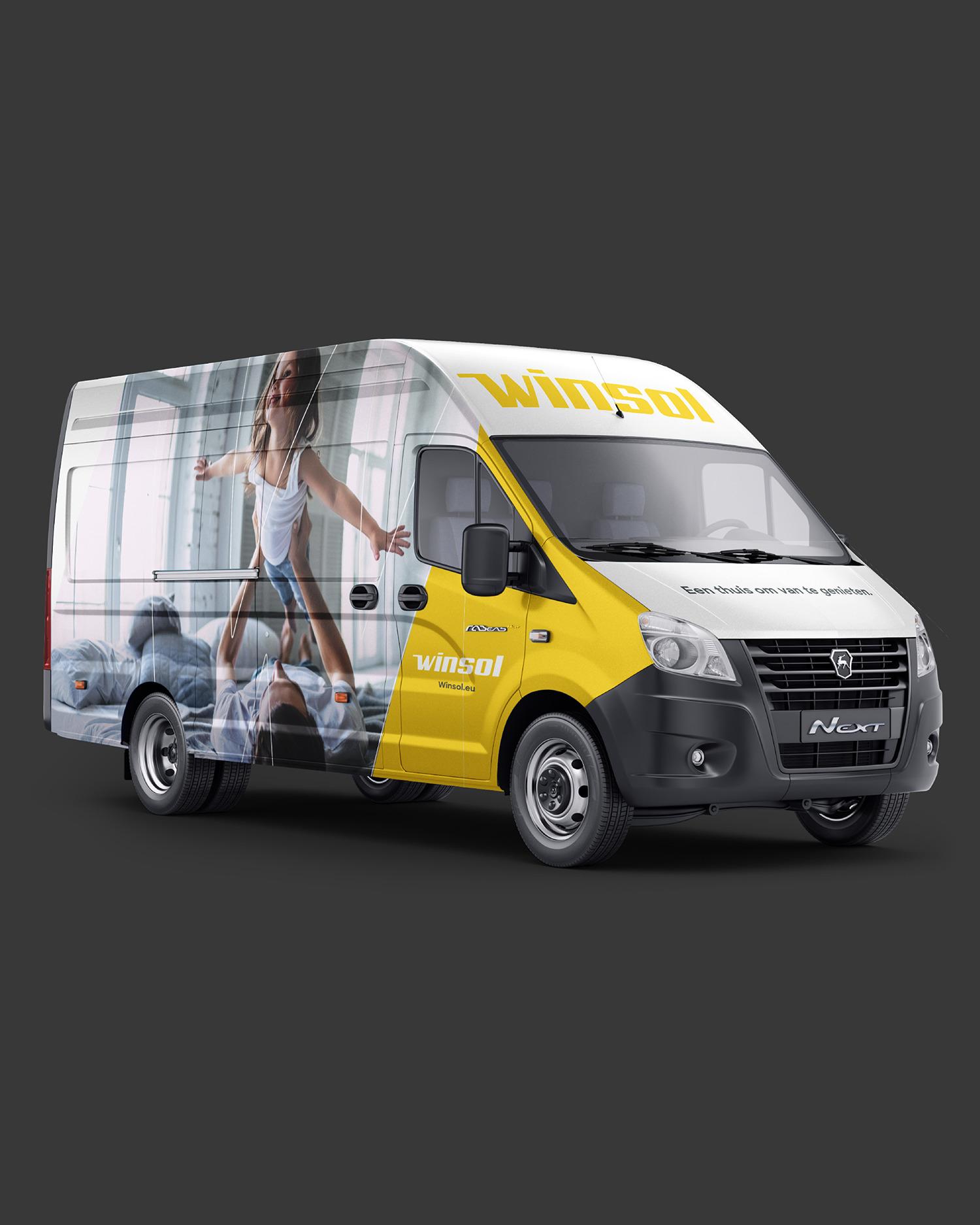
The brochure for Pergola Z!P carries the new premium branding. The SO! range has a silver foil logo. Stationery uses the joyous yellow, with an embossed logo for premium print. The vans have two different designs, one on each flank. At a house, they show a homely image. For passing traffic, the focus is on the avatar and tagline. The radio commercials have 'homecoming' as their theme, and sonic branding reinforces the sense of harmony.