VDK bank
We put their money where their mouth is

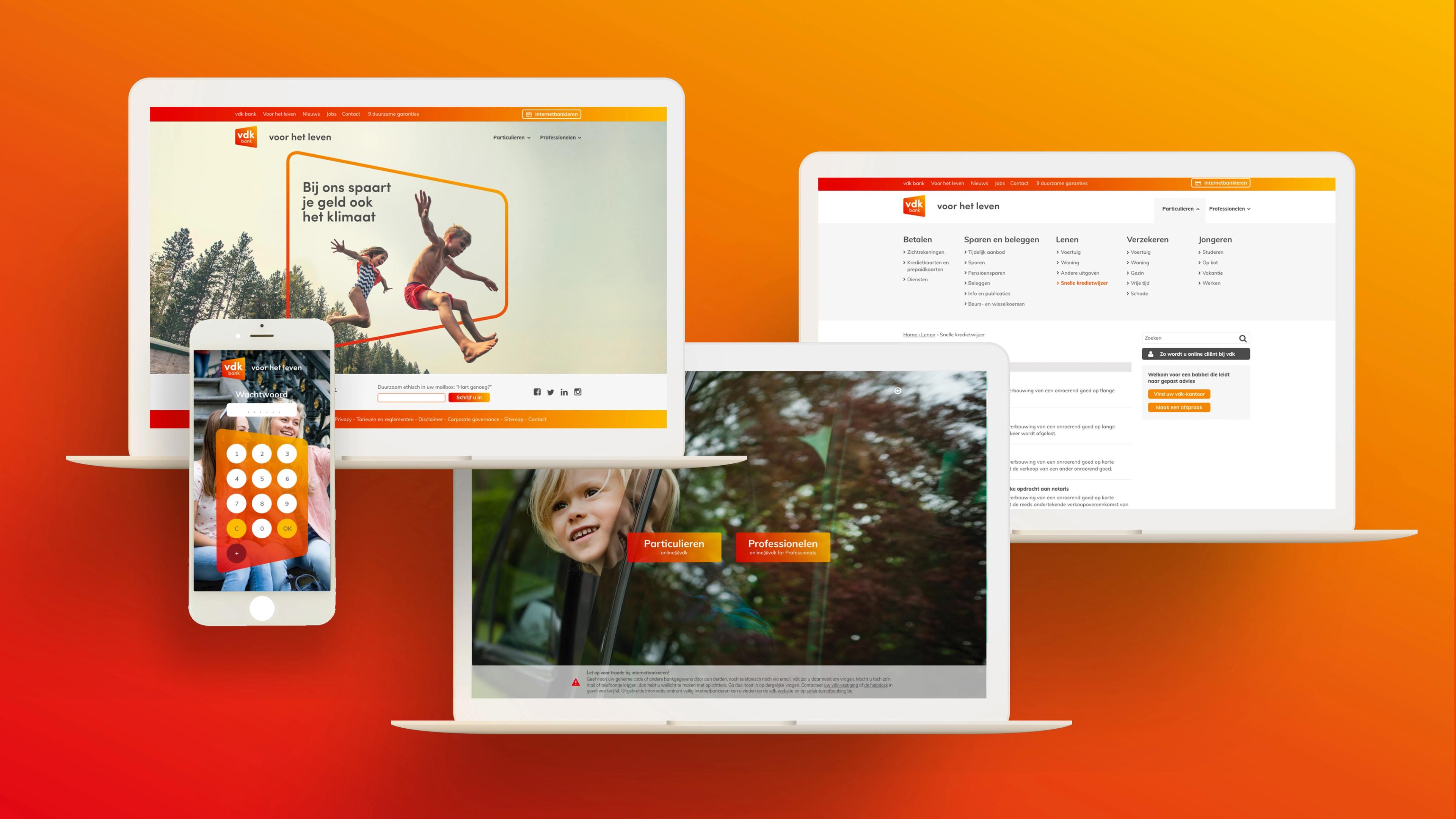
VDK Spaarbank is an independent bank with familiar faces and honest advice. We designed a rebranding that is as refreshing as that vision. A graphic shape, a transparent look and the youth account JOVO make it visible.






The story behind the work
What was the challenge?
VDK Spaarbank was founded in 1926 and has always focused on investing in what truly matters. The bank is still independent and proud of it. VDK sees a growing demand for a bank where familiar faces give honest advice and where clients' needs come first and income plays no role. In an era of self-banking apps, VDK wants to stay close to people and gladly welcomes them in its offices. The challenge was a rebranding that is as refreshing as this vision. VDK has been committed to sustainability long before it became a hashtag, and the new brand had to reflect that.
What choices did we make?
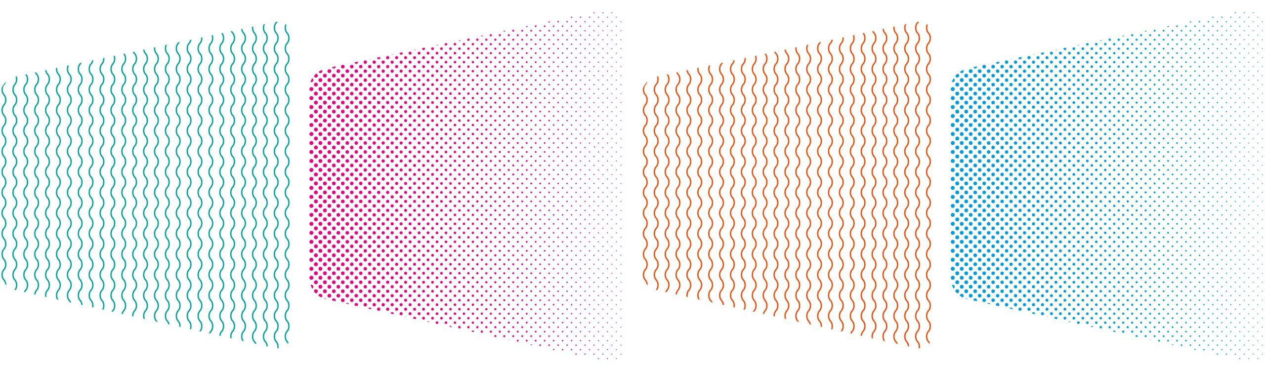
VDK takes its time to explain to people what happens with their money. It takes finances from Wall Street to Main Street. The bank invests in businesses and enterprises that truly contribute to a better society. VDK is in it for the long run and focuses on personal contact and continuity in service. People can rely on its expertise and support at any time in their lives. VDK looks at an individual's personal situation and at the broader context at the same time. We chose a graphic shape to express that. VDK is also open in the sense of transparency and sincerity. That approach offers peace of mind, and we made it the starting point for the visuals.
What did we create?
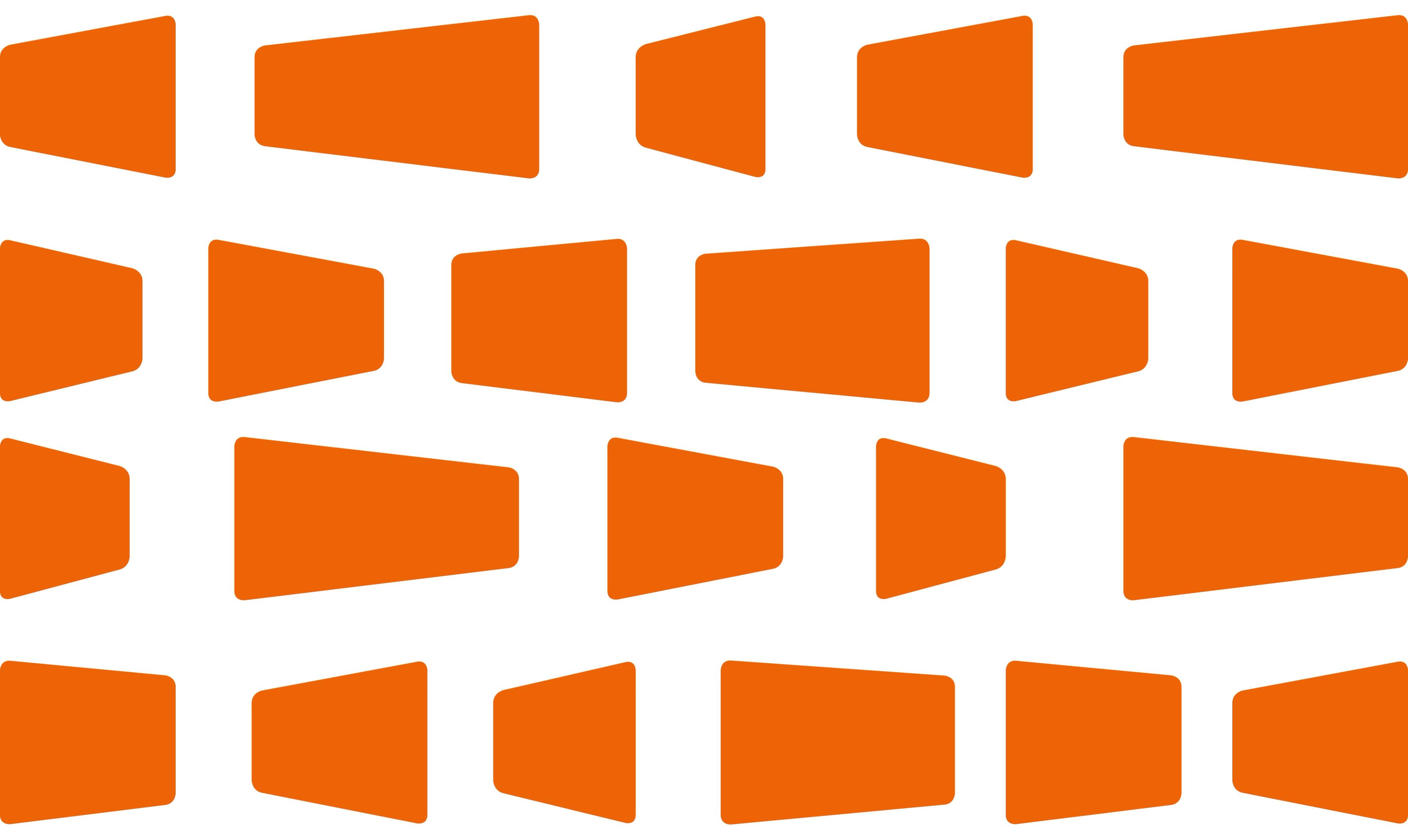
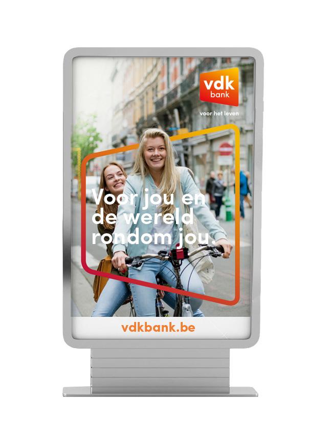
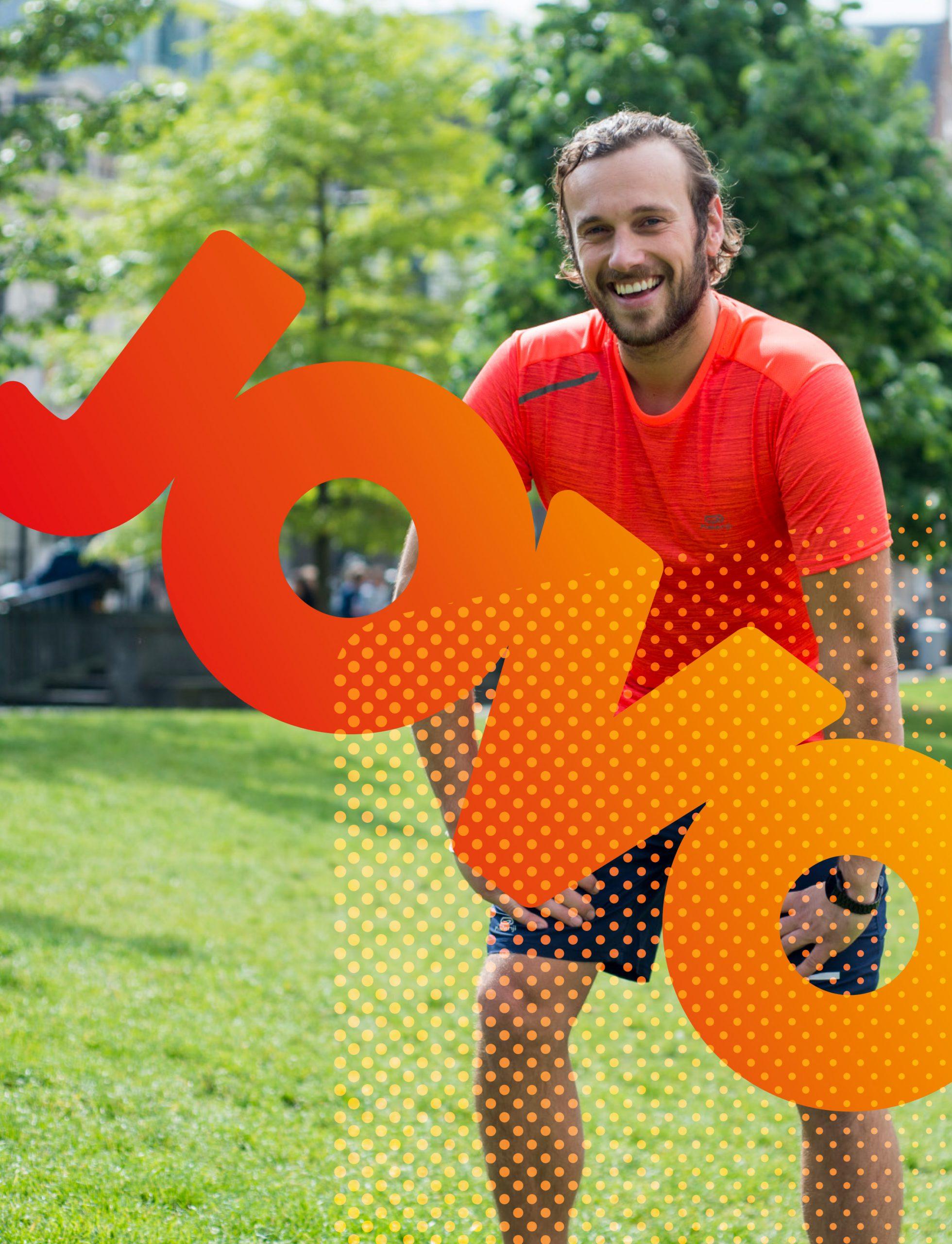
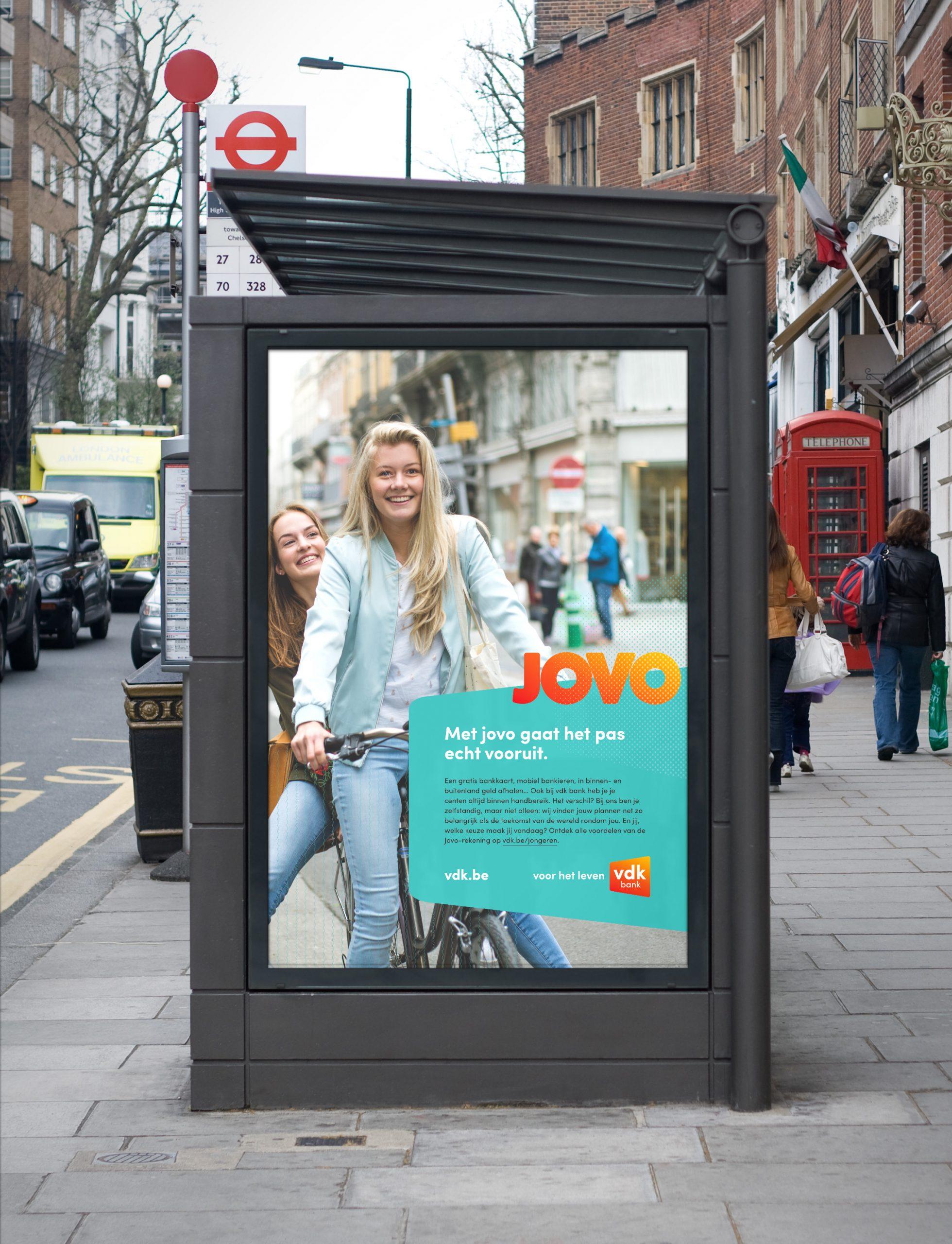
We devised a rebranding for VDK Spaarbank. At its heart is an eye-catching graphic shape that symbolizes VDK's 'window to the world'. The visuals reflect the bank's openness and the peace of mind that comes with it. Next to 'fair' and 'firm', VDK should also be known for being 'fun'. JOVO, VDK's account for the young and (int-)restless, shows the versatility of the design. It adapts easily to what clients expect on various levels.