Stokers
A token of burning ambition

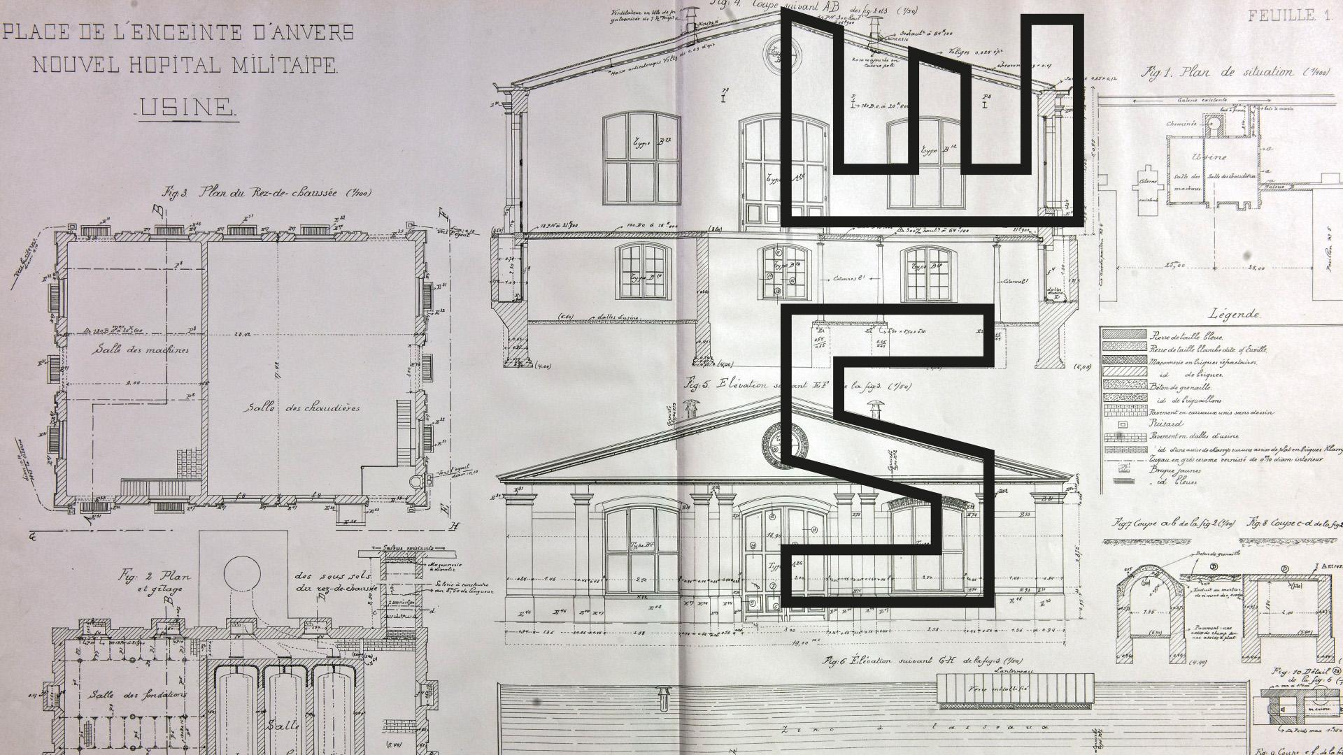
Stokers is a coworking space in a former boiler room in Antwerp. We gave it an identity built on the lines of its restored façade: a token of burning ambition.









The story behind the work
What was the challenge?
Stokers is a coworking space in Antwerp. For now, because the aim is to become the reference for business networks in Belgium. André Duval is the driving force behind the enterprise, so the ambition comes as no surprise. Stokers brings together a select group of entrepreneurs who operate in a league of their own. The brand had to show that. It needed a distinctive identity that sets Stokers even further apart and carries its exclusive character on every medium.
What choices did we make?
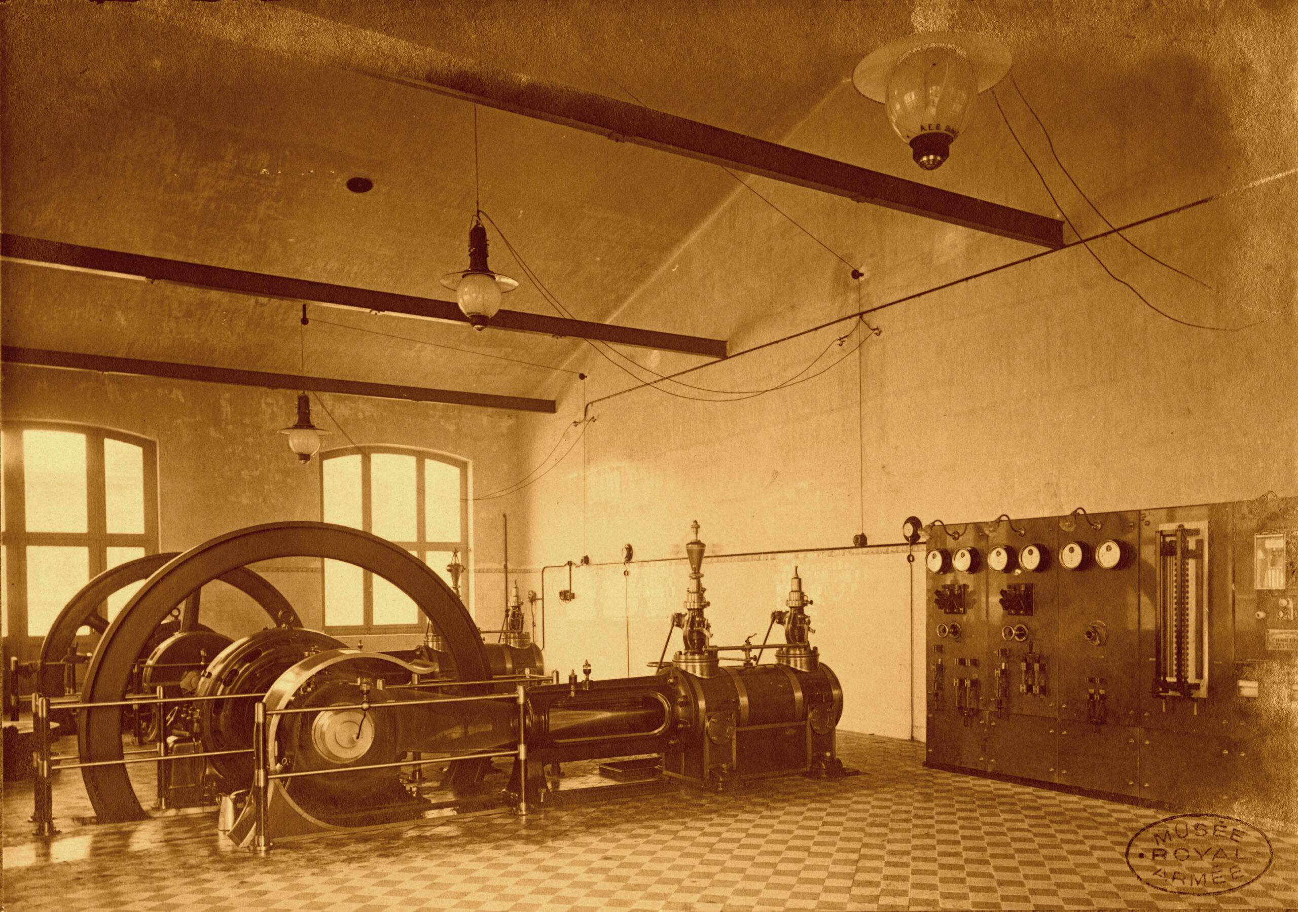
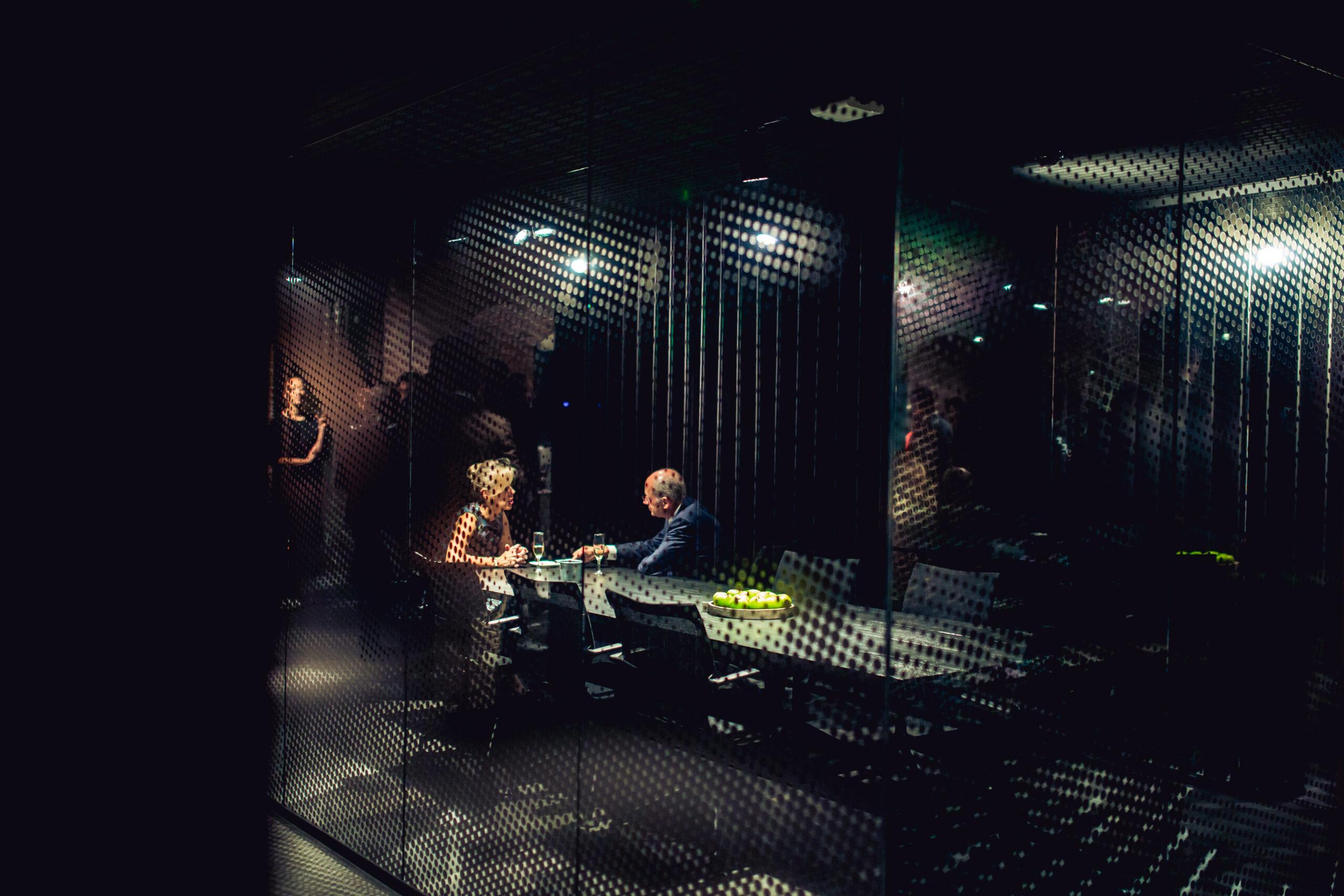
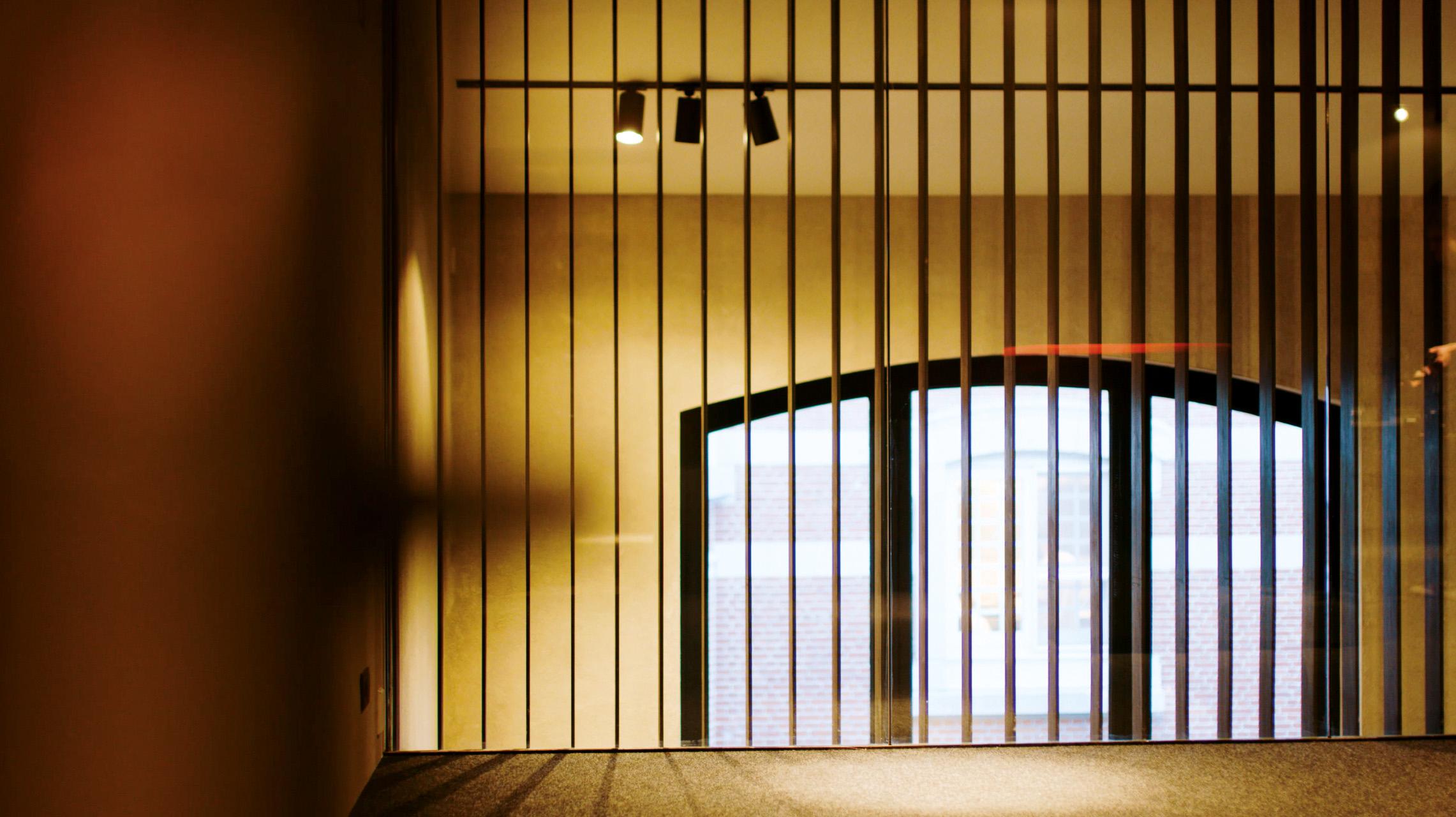
Stokers sits in a former boiler room in the middle of a completely repurposed military hospital. The façade has been restored with the utmost respect for detail, and its distinctive lines became the base of the logo. We wanted a token of burning ambition: a quality seal that carries the ambition of Stokers on any medium and in any aspect. Stokers sets the new standard in coworking, and the identity had to say so. For the website navigation we mimicked the large blinds inside the building. They evoke a sense of seclusion and suit the exclusive character of the members.
What did we create?
The logo comes from the lines of the restored façade. To give Stokers more charisma, we added a bold typography and a set of icons that combine past, present and future. The custom-made typeface also provides a wide range of functional icons for print, web and signage. Together with the architects of Anversa, we manufactured meticulously milled indications for meeting rooms, lockers and sanitary facilities. They are sturdy yet refined. The heavy raw steel, also used for the flooring of the mezzanine, is attached to the wall with some free space in between, as if the signs are floating. On the website, the navigation copies the building's blinds. “Wonder what’s inside?”