Scopernia
Move beyond

Duval Union Consulting helps companies rethink their business models in a changing society. Its new style of consulting needed a new name, so Scopernia was born, with a Copernican idea behind it. We gave it a name, a logo, four colours, the tagline 'move beyond' and a full set of applications.


The story behind the work
What was the challenge?
The world keeps changing. Anticipating digital disruption used to be enough for organisations to grow. Today, change also happens in housing, mobility, sustainability and healthcare. Companies have to look at their purpose and business strategy through a broader lens. Duval Union Consulting helps them take a cross-sectoral approach and rethink their existing business models. The CEOs, Dado Van Peteghem and Jo Caudron, use their expertise and broad network to help organisations rescope their purpose in turbulent times. This new style of consulting needed a new name.
What choices did we make?
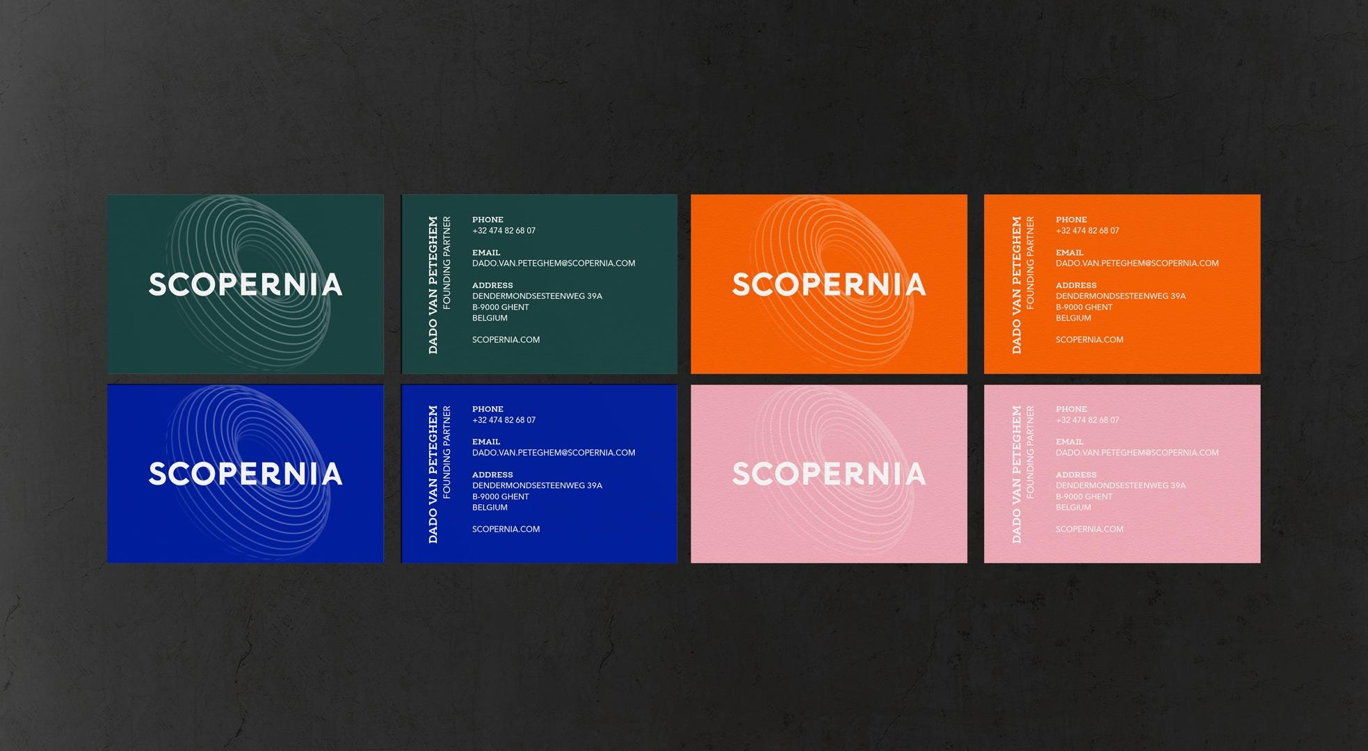
The name Scopernia carries meaning. It stands for 'scope', 'Copernican Revolution' and 'purpose' (nia in Arabic). Just as Nicolaus Copernicus turned the world upside down by proclaiming the Sun the centre of the universe, Scopernia counters mainstream business thinking and brings a Copernican Revolution to your company. The logo is based on Copernicus' astronomical model. Its circular letters give a professional yet playful look and feel. Four colours cover the two sides of the company: grounded green, promising pink, brilliant blue and optimistic orange. They stand for the elite, authoritative and rebellious consulting world and for Scopernia's playful, young approach. The tagline 'move beyond' fits how Jo Caudron and Dado Van Peteghem work. They move beyond the status quo, the odds, the headlines, opinions, doubts, politics and digital innovations.
What did we create?
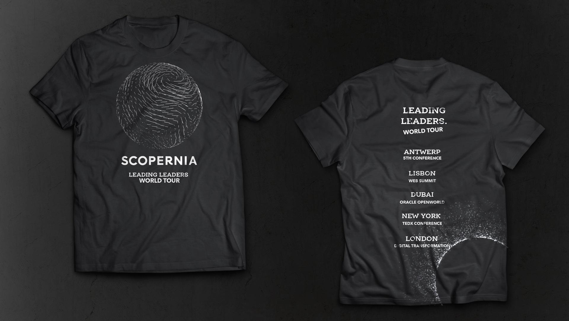
We created the name Scopernia, the logo, the four-colour palette and the tagline 'move beyond'. The tagline tells clients to move beyond their own industry, change their course and stay relevant in tomorrow's society. We translated the new identity and style into a professional website design. We also made a range of applications: business cards, a letterhead, an email signature, an announcement letter, a Facebook page, flags, posters, Keynote slides, event badges and a tour t-shirt. The vibrant colours put the brand on the map.