Livlina
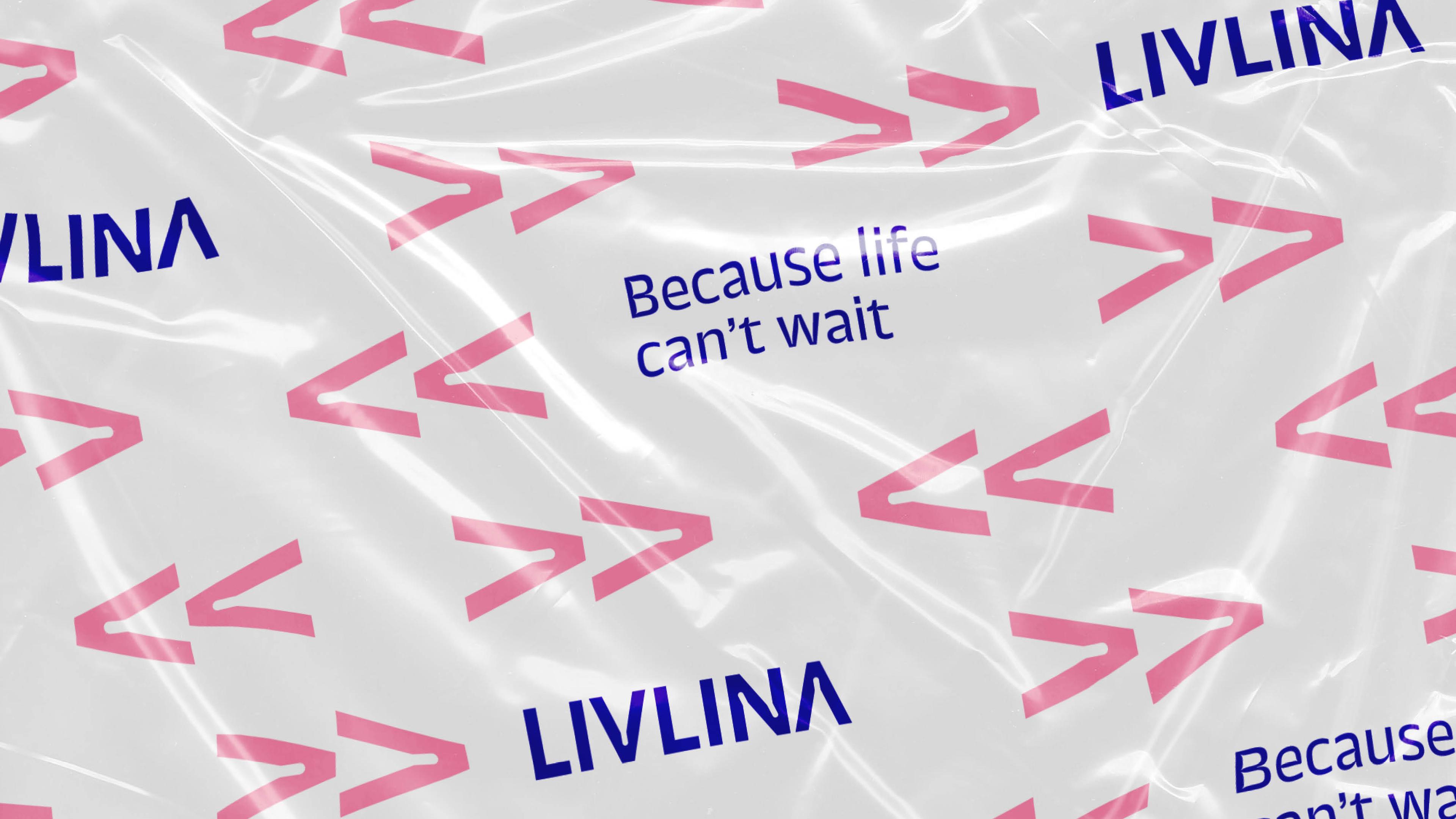
Because life can't wait
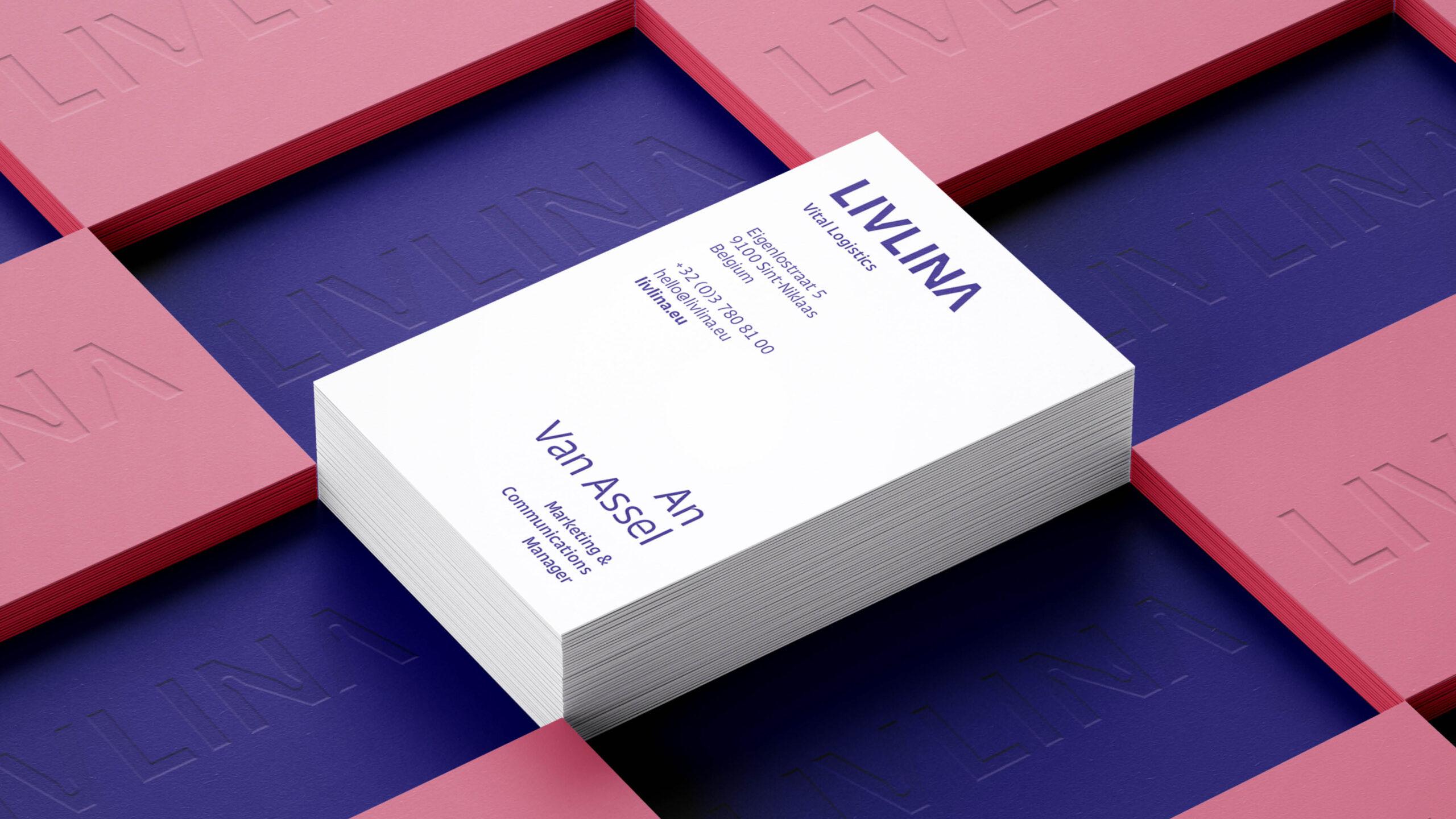
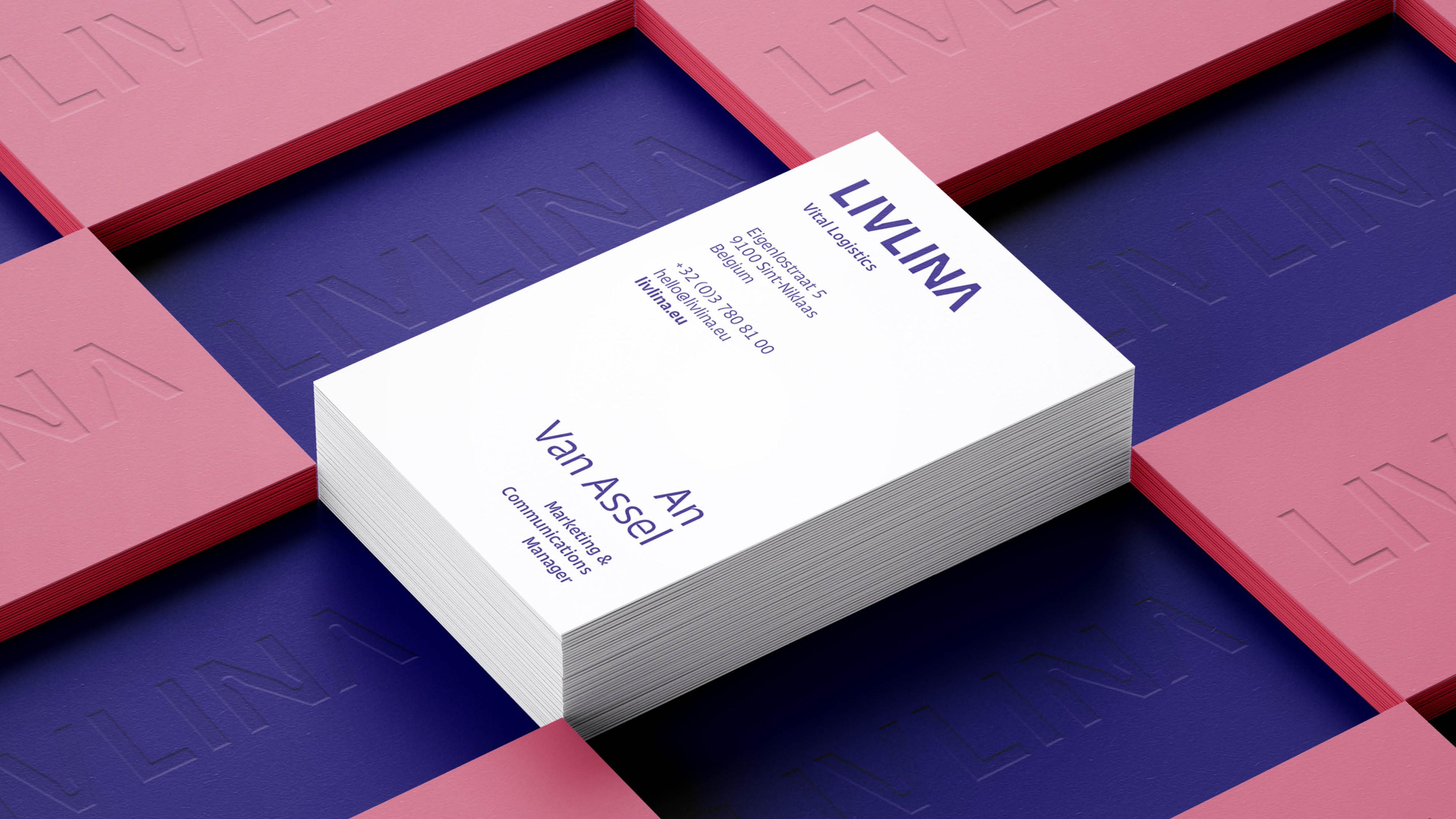
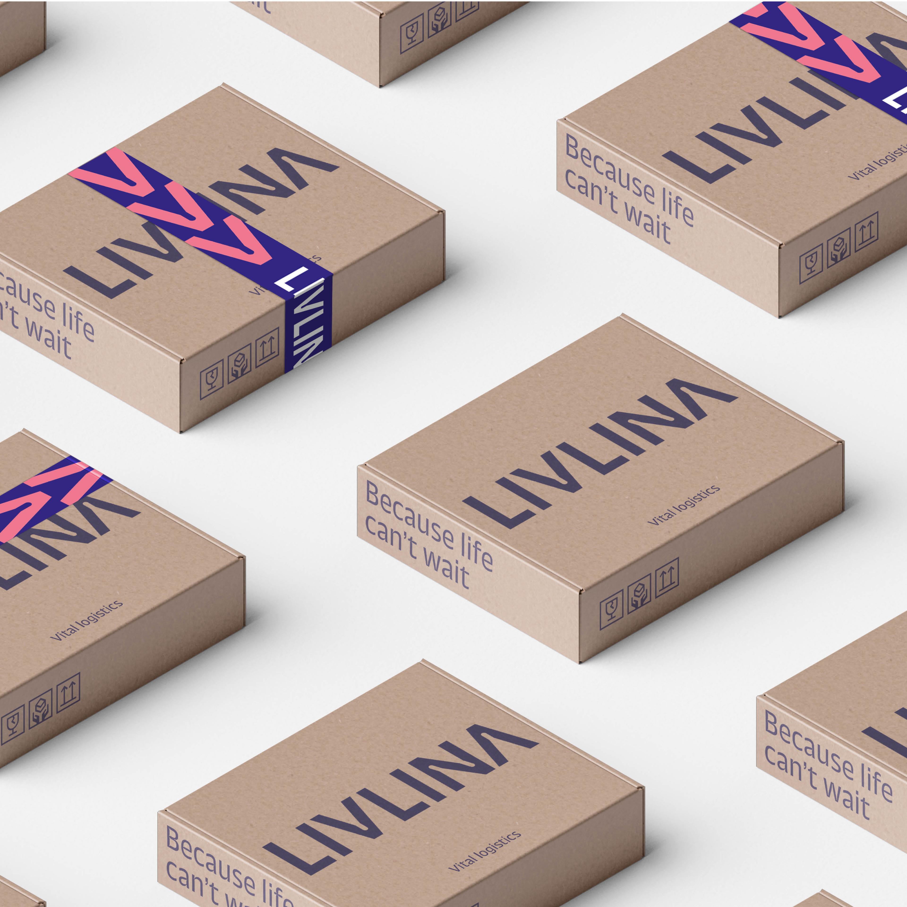
Pharma Distri Center, part of the Febelco Group, became Livlina. A wordmark built on the ink trap technique, a tagline and a nominator show who they are and what they do.




The story behind the work
What was the challenge?
Livlina came to us as Pharma Distri Center (PDC), part of the Febelco Group. PDC distributes pharmaceuticals, works internationally and keeps looking for ways to optimise. That made them open to a new route for the business. They wanted a complete, future-proof turnaround, a step beyond a small facelift with short-term sales impact. Their wishes were specific: a distinctive PDC brand with a long-term brand effect, and a stronger connotation as a partnership brand. There was one more point to solve. In a setting where people may be confused about what Livlina is or does, the brand had to be clear right away.
What choices did we make?
We started with a workshop and a strategic deep dive. It showed us the story: Livlina is "your partner in the pharmaceutical industry, your logistics partner in health", offering a high-quality service to manufacturers, buyers, patients and employees. Their balance between the human touch and technology had to show in the copy and the visual identity. For the wordmark we chose the ink trap technique, because in the Livlina philosophy the details make an actual difference. We added two ingredients, a tagline and a nominator. The tagline captures people's attention and carries the key message. The nominator works like the package insert of a strip of pills and states the company's purpose.
What did we create?
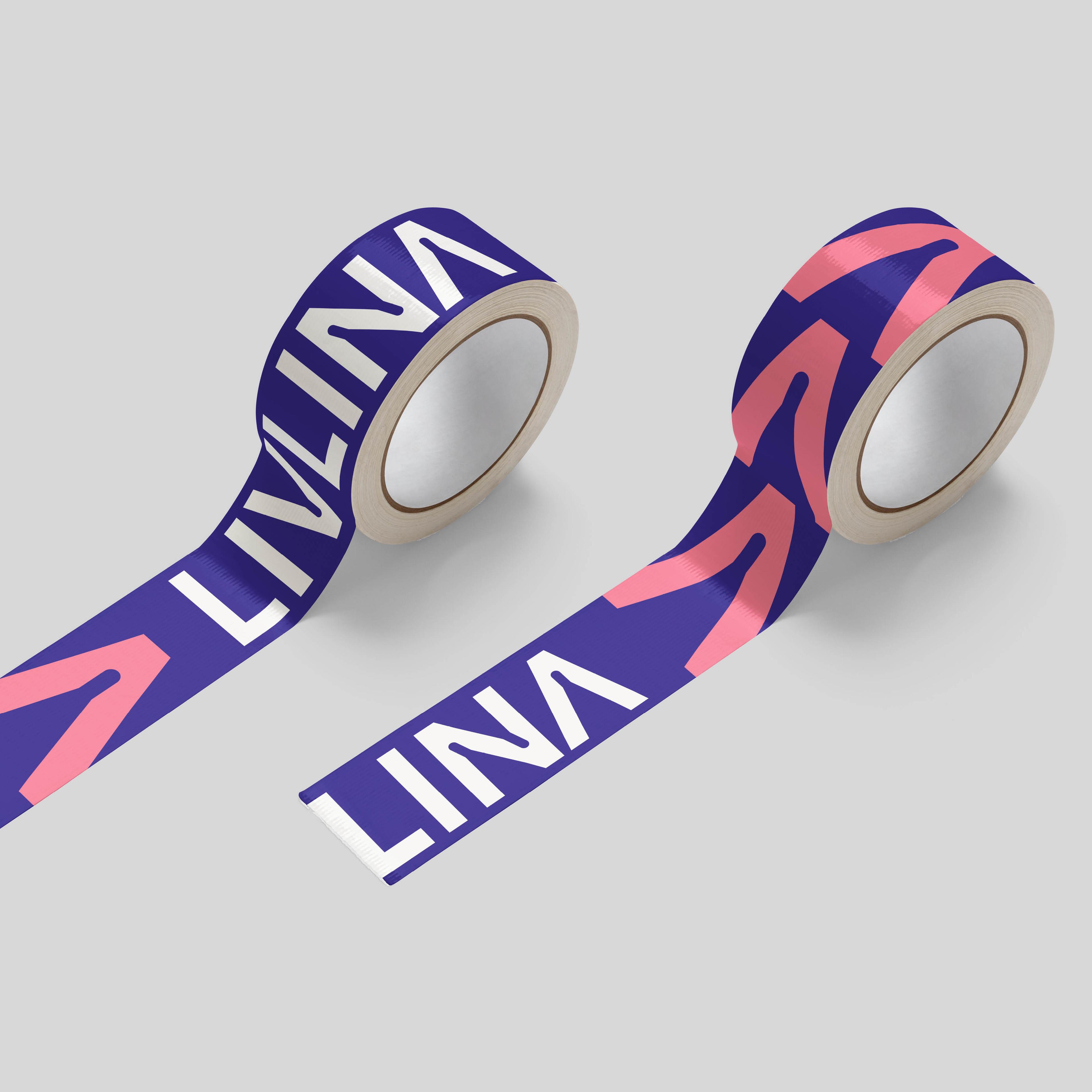
We made a clear and distinctive wordmark inspired by the ink trap technique. White space in tight corners lets the ink spill and fill these areas, which gives a perfect print even on the smallest applications. We shaped the ink traps so they symbolise a pill. The font is visually appealing too. Next to the wordmark we wrote the tagline "Because life can't wait" and the nominator. These two words give immediate clarification about what Livlina is or does. The brand story, the copy and the visual identity all reflect the balance between the human touch and technology.