Emma’s Kitchen
A fresh take on fast food

Emma's Kitchen is a new healthy fast food restaurant in downtown Antwerp. We gave it hand-drawn designs in vibrant colours and a voice that is direct, cheerful and sincere. Quick and quality go together here.

The story behind the work
What was the challenge?
Emma's Kitchen is a new healthy fast food restaurant in downtown Antwerp. It uses only crisp, natural ingredients from the morning market and prepares lunches and dinners à la minute. Eating healthy and enjoying your meal go together. It's all about balance. At Emma's Kitchen, quick and quality go together. The team works out which ingredients pair well and does the cooking. Guests order, taste the goodness and share their #omnomnom pictures. Our job was to give this fresh take on fast food a look and a voice.
What choices did we make?
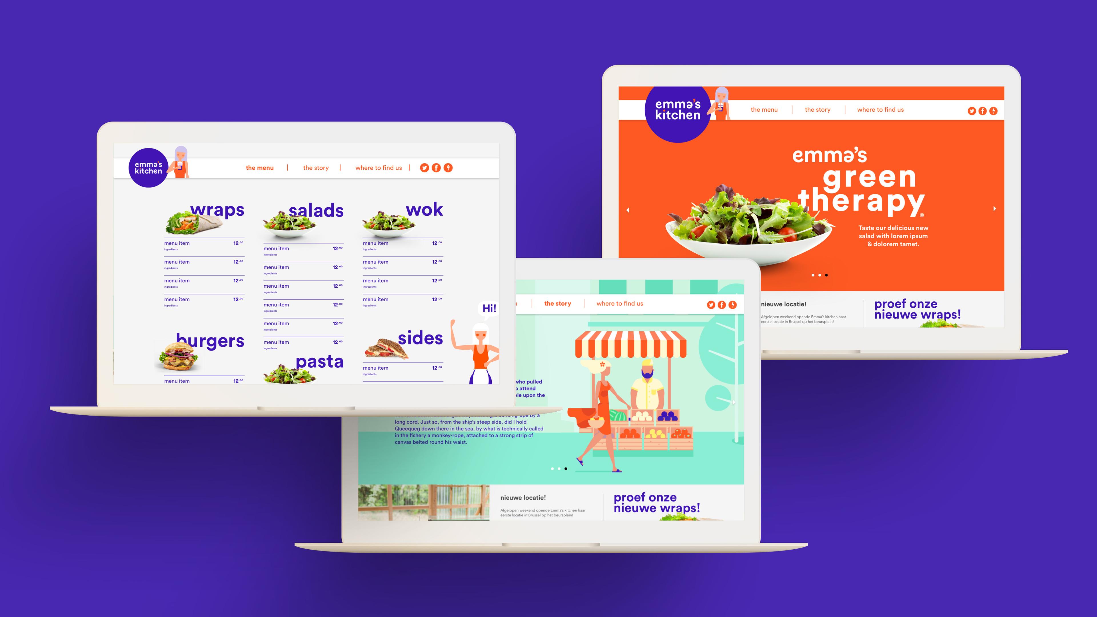
Emma's Kitchen is a place you can call home. Vibrant, bright colours reflect the uplifting attitude behind the atmosphere we wanted to create. We chose hand-drawn designs. They took a little longer to prepare than the food does. Emma speaks to customers the way a chef should: direct. She doesn't shout or throw knives. She adds a touch of happiness to how she communicates and interacts with customers. Sometimes tongue-in-cheek, always sincere and positive. The colours and the voice carry the same uplifting attitude.
What did we create?
We made a hand-drawn design for Emma's Kitchen in vibrant, bright colours. We also gave Emma a voice that speaks to customers directly and with a touch of happiness. Working on it taught us at least one thing: quinoa is significantly richer in nutritional value than our beloved potato. The restaurant serves mouth-watering lunches and dinners made à la minute from ingredients from the morning market. Our designs took a little longer to prepare. The result is a fresh take on fast food that feels like home.