Buro Project
Creating the “you got this” office.

Buro Project creates environments where employees feel as comfortable as inspired. We realigned its brand with that work, with a gently retouched logo and an identity conceived as an interior.



The story behind the work
What was the challenge?
Buro Project has been working on professional facilities since 2002. The company realises environments where employees feel as comfortable as inspired. It starts from an in-depth understanding of the customer and devises surroundings that fit the atmosphere of that customer's corporate world. Our goal was to realign their brand with their work. That meant bringing the logo up to today's standards and giving the social media channels a more structured direction. The new website and the upgraded branding also needed a good way to be introduced.
What choices did we make?
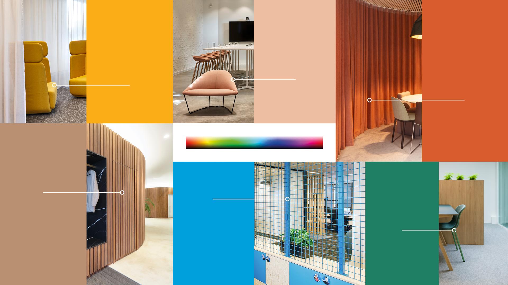
We treated the logo like a UNESCO world heritage site. We retouched it very gently, with only the minimal changes needed to meet today's standards. A more sophisticated dark grey shows a modern company with experience and knowledge. A second layer carries the playful, welcoming side: the logo colour adapts itself to the photography, like a chameleon. The tagline expresses Buro Project's comprehensive approach. It is a sensory and emotional perspective, fed by colours and textures, that connects people and place, and task and talent. Buro Project constructs the interior that shapes the job. We conceived the identity as an interior. All elements can be applied dynamically to highlight specific details and keep a clear overview. Space controls a refreshing balance and maximises the Feng Shui.
What did we create?
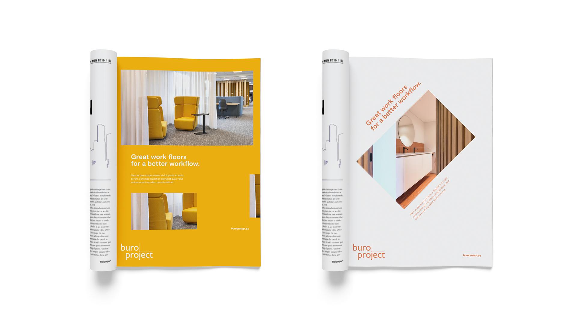
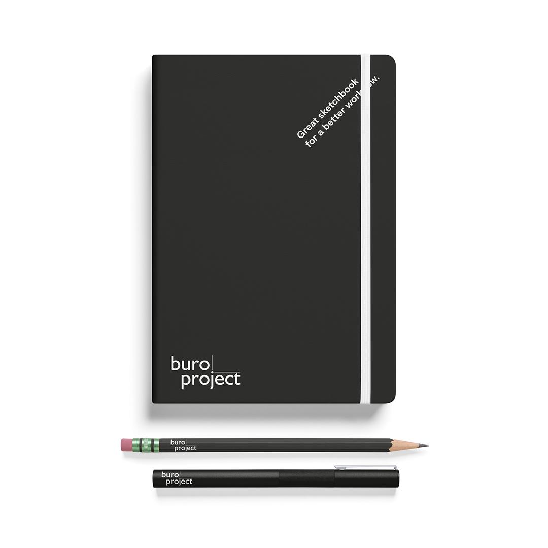
We gave Buro Project a gently retouched logo in dark grey, with a colour that adapts to the photography. We built the identity like an interior, with elements that can be applied dynamically. For the user experience we chose a layout that is easy to find your way around in, with clear headings and an appealing flow. A brochure and an ad show the identity in use. We also developed a social media strategy. It pulls the different channels in a more structured and cohesive direction and works out the best way to introduce the new website and upgraded branding. Our advice included tips, tricks and tools for a flawless follow-up.