Benjamine
Class and creativity make a great pair

Benjamine, a kids' shoe store in Mortsel, reopened after two years. We created a contemporary, playful branding that keeps the name and the iconic red, with a logo whose letters are made of colourful shoelaces.


The story behind the work
What was the challenge?
Benjamine has been a household name in Mortsel and beyond for years. Over time the shoe store for kids became a true landmark in Mortsel's main shopping street. When it reopened after two years, it needed some serious repairs. The brand needed to be revitalised. We took that heritage into account in the briefing and aimed for a contemporary, playful branding. We believe class and creativity make a great pair, and Benjamine was a good place to show it.
What choices did we make?
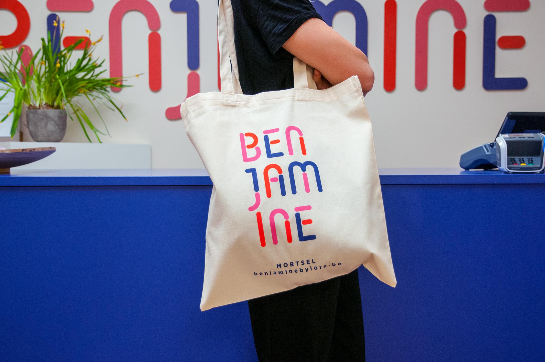
We started from the store's heritage. In the briefing we took Benjamine's history into account, so the name stayed and the iconic red remained one of the primary colours. To express originality, we designed a customised font for the logo, in which every letter is composed of colourful shoelaces. The horizontal logo would not work on every application. We therefore developed a vertical adaptation that freely hyphenates the wordmark, so it fits particular media. This adaptation also shows the playful spirit of the brand.
What did we create?
We made a contemporary, playful branding for the kids' shoe store. The name and the iconic red stay recognisable. The logo uses a customised font with letters of colourful shoelaces and comes in a horizontal and a vertical version. The rounded shapes and vibrant colours also inspired the interior decoration. In the spacious store, the cheerful shelves and the bold blue counter immediately draw attention. The vibrant colours bring the store to life.